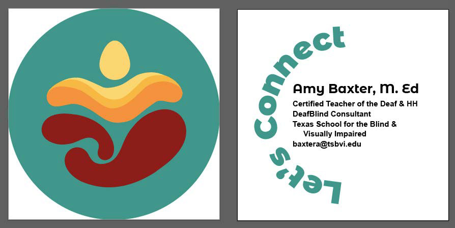
Hard copy - Front
Hard Copy - Back
Process Overview
Amy & I met up mid-December 2018 to discuss her vision and requests. She requested a brand new logo to symbolize and recognize her team that works with Deaf and Hard of Hearing DeafBlind kids at the Texas School for the Blind & Visually Impaired (TSBVI). Once the logo was created, she wanted business cards. As a designer, I needed to understand where she was coming from, her role, what she does, her vision and goals. We discussed that along with her rough visualization of the logo and business cards.
Amy shared a few pictures of business card designs and the logo concept she liked. A unique, odd, and unusual kind of design to catch attention of others was one idea. She also appreciated the idea of using a slogan or a saying on one side of the business card.
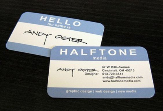
Unusal design of a business card
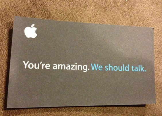
Slogan idea
logo concept
We discussed the adjectives that fit well with the design which were: unity, together, grow, connect, collaborate, team, teamwork, and thrive. As for the logo, she wanted the design to have a subtle and hidden message, using American Sign Language (ASL) to symbolize her concept rather than making it obvious with hands. With the logo being abstract and subtle, the client liked the idea of hearing others' perspective and interpretation of the logo. She shared another picture of a logo design created by the National Deaf Center (NDC). We watched a video they created as well, see below. The video has been trimmed to the last part where they show how the logo was created.
Signers signing words: "National Deaf Center" -- visually clear showing how the logo was created based on their ASL.
The logo design will stand alone or be a combination of object/pictorial and abstract. It will represent a team that works with deaf and hard of hearing blind children who have entered TSBVI temporarily until they acquire the skills, confidence, and knowledge of how to lead their own lives before entering them to other different (district) schools. The team truly cares, helps, works, guides, and teaches children to grow, thrive, and "fly free". We discussed some ideas of different sayings for the slogan. I explained how I work using the basic process: research, brainstorm, thumbnails (rough, semi-final, and final), and so forth. We wrapped our meeting in agreement to revisit the process in a month after the holidays. We communicated with each other mostly through video-phone and email from that point and on until near the end.
Research
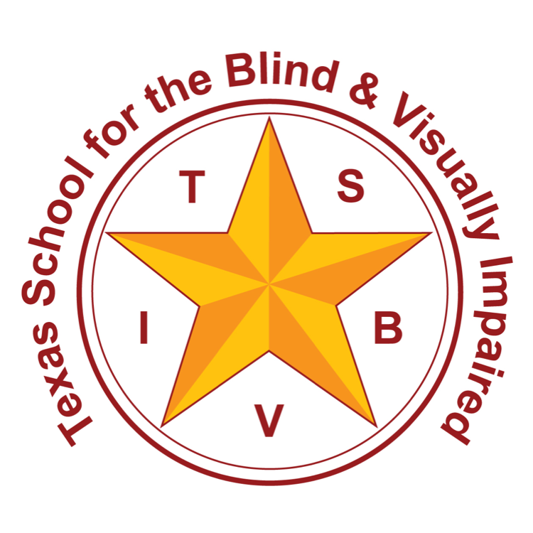
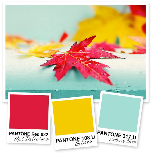
First I researched and searched for inspiration using Google & Pinterest. I researched different communication methods (style, shapes, materials, symbols, etc.) that DeafBlind people use, ASL, patterns, colors, shapes, and so on. I shared my Pinterest board with my client. Amy mentioned she would like her logo colors to be similar to the TSBVI color logo and was open to a third color. Below are the images of TSBVI logos and the possible third color chosen by Amy & her team: aqua blue.

TSBVI Logo 1
TSBVI Logo 2

TSBVI Logo 3
Possible logo color scheme
Along with researching and pinning, I also did some scribbles in my sketchbook.


Rough Thumbnails
In mid-January 2019, I shared my research, scribbles, and thoughts with my client. Amy looked at my scribbles and liked the ones I marked in orange. Also, I felt it was vital to decide which slogan the team would feel strongly about before I proceeded with designing. They chose, "connect - collaborate - thrive". With Amy's initial feedback from first scribbles and chosen slogan, I was able to proceed and complete 16 rough logo thumbnails fitting the slogan. Amy immediately recognized and loved the bottom part which is a subtle ASL signs of connect and collaborate. The "thrive" aspect was a challenge. Amy was unsure about the lines and asked me from my perspective. I explained that I felt the word "thrive" creates emotions and signing that word in ASL is in motion more than just a pictorial sign. I came up with the idea of making thick to thin lines to symbolize growth as in thriving. In some other thumbnails, I created a "v" like shape to symbolize vaguely the ASL sign of thrive and make it look like a person with arms out in the air. I asked Amy and her team to pick which 3 of 16 they liked. They chose 11, 14, & 15 (marked in orange below) with some feedback.


Thumbnail Sketches
From there, I created the 2nd round of thumbnail sketches but narrowed them down to 9 and inked in black and white. I designed the logo in black and white from the beginning because the focus should be on the shape and its meaning. When printing a logo in black and white, I want the logo to make sense before adding color. Amy and her team were to pick 3 out of these 9.

Refined Roughs
Amy and her team chose number 3, 4, & 9 from the thumbnail sketches. She definitely did not like #8 - felt it was too simple and not enough details. She felt #3, specifically the bottom part, was the most balanced. She also loved the sunrise-thrive part in #4. She liked #9 as well and suggested I try combining #4 & #9, somehow incorporating the sunrise-lines. She wanted the logo to feel balanced in a circle shape, using the thrive symbol with lines in either hands/arms, and the "head" will be an egg shape representing the concept of change from baby to mature.
With their feedback, 3 refined roughs of thumbnails including greyscale tones using pencil were created. This time, Amy and her team were to pick 1 out of the 3.


Digitalized Color Roughs
Amy and her team immediately removed the #1 logo. They had a hard time deciding which to pick from the other two. They finally decided to go with #2.
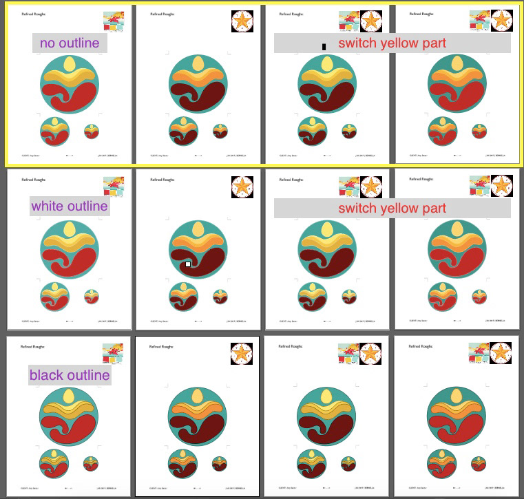
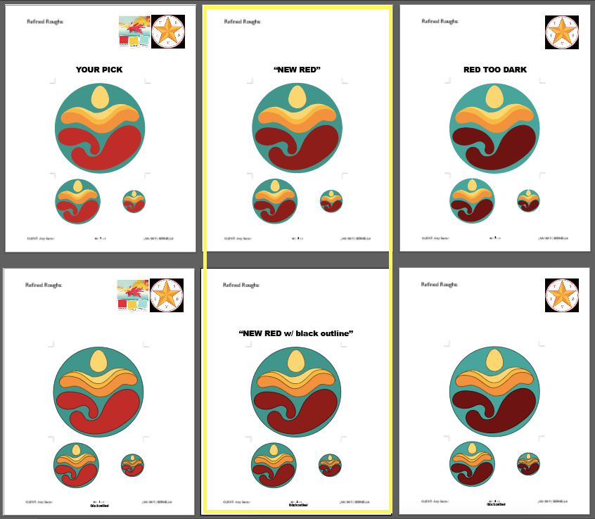
The next step was to digitalize the logo in color using Illustrator. After I completed them, I sent my client a screenshot and a PDF file showing each logo individually. Three different style logos with 4 color schemes were created. If you look at the screenshot below, there is a yellow box around the first row where the logo has no outline. The second and third row had the same logo design as the first row except the designs had white (2nd row) and black (3rd row) outlines. The first column followed the color scheme of the maple leaf image on the upper right corner. The second column followed the TSBVI logo color scheme. The third and fourth columns are a combination of the first two color schemes with yellow switched. These color scheme works well as I tested them by printing logos in black and white/greyscale. Two smaller images (2" x 2" & 1" x 1") below the larger image (4" x 4") shows how the logo will look in a smaller scale. This will help the client decide which to choose.
Amy and her team chose the last column, with no outlines and black outlines. They did not like the logo with white outlines. However, the red part was a bit too bright for their liking. They wanted the red to be darker but not as the red revealed in the screenshot.
"The New Red" Digitalized Roughs
I revised the color red and submitted a new screenshot and PDF files to my client to review for approval before finalizing the logo. In the screenshot, I placed "the new red" logos in the middle with light red on the left and dark red on the right for visual comparison. The bottom row has the black outline. Amy and her team approved the new red.
Font & Color Palette
I finalized the colors chosen to use for the logo design. I also chose the font. Amy and her team wanted to use simple, bold, and modern san serif fonts. I played with san serif fonts and decided to go with Montserrat Alternate (black & bold) and Arial (bold). Here are the color & font information used.
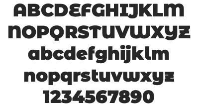
Montserrat Alternates - Black
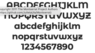
Montserrat Alternates - Bold
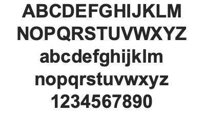
Arial - Bold
Business Card Design
After finalizing details on the logo design with the new red color & chosen fonts, the next step was to design a business card using the new logo. Amy wanted her business cards shaped in a circle with the new logo on one side and the information on the other side. She preferred to use modern, san serif fonts.
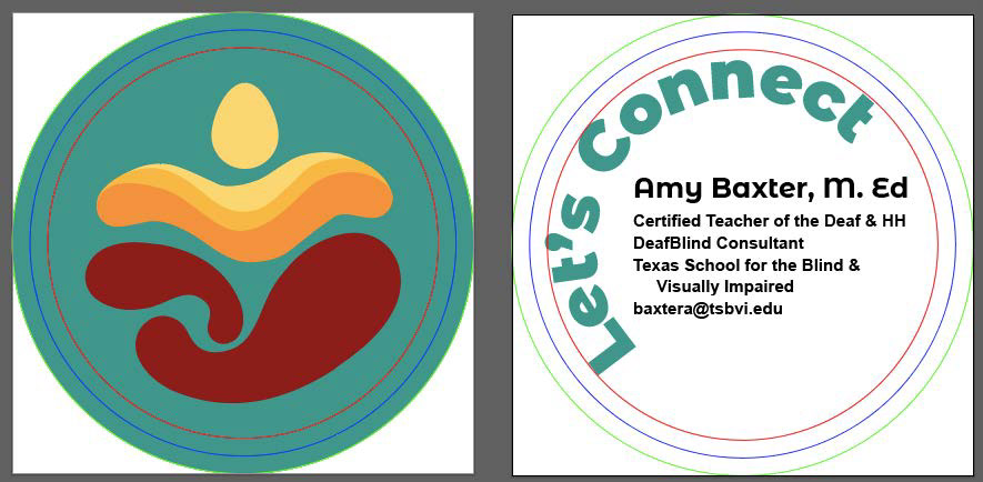
I then designed 5 different styles and submitted the PDF file to her. The first image has red, blue & green outlines for safe zone guidelines. This was shared with the client for better understanding. The red is the safe zone, anything inside red is safe and will not be cut off. The blue line is the original size of the card (3"x3") and this is where it will be cut. The green line is the bleed zone.
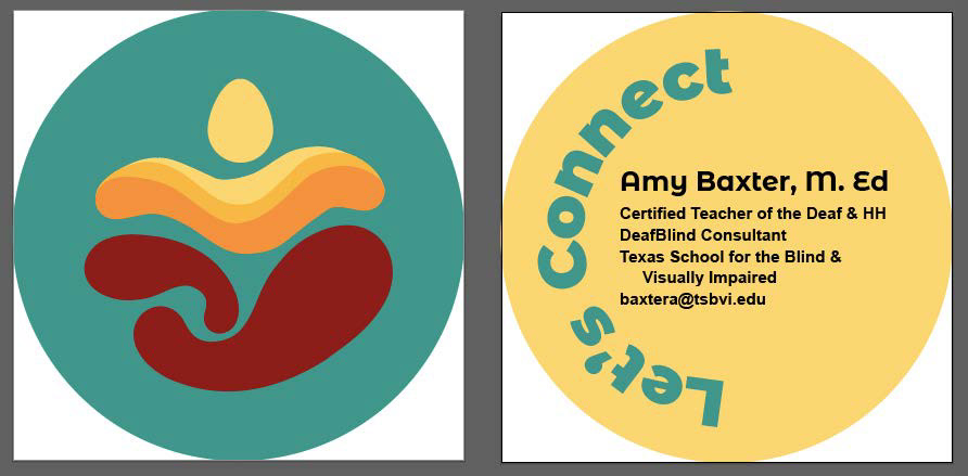
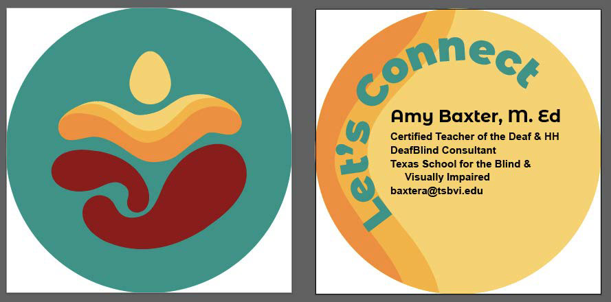
The front side of the business card will have the final "new red" logo design. The back side will have the contact information with 5 different designs for the team to pick.
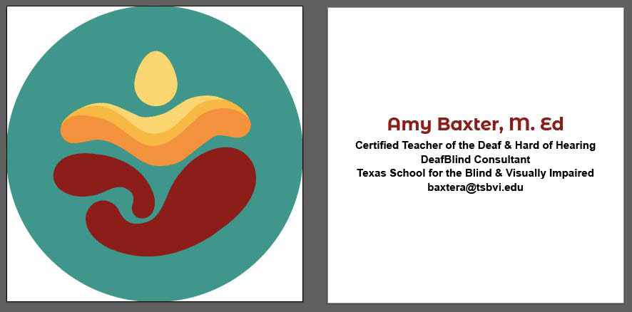
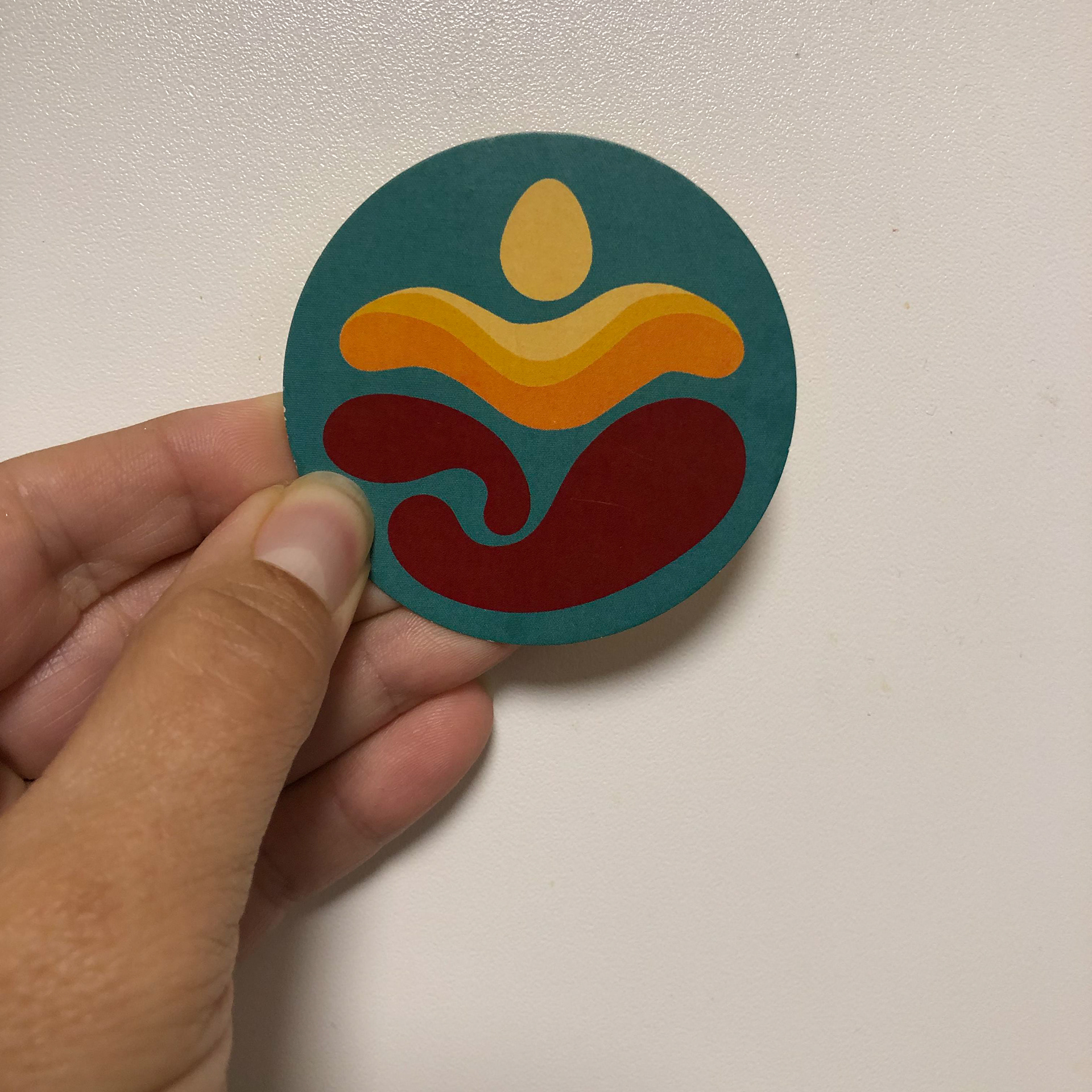
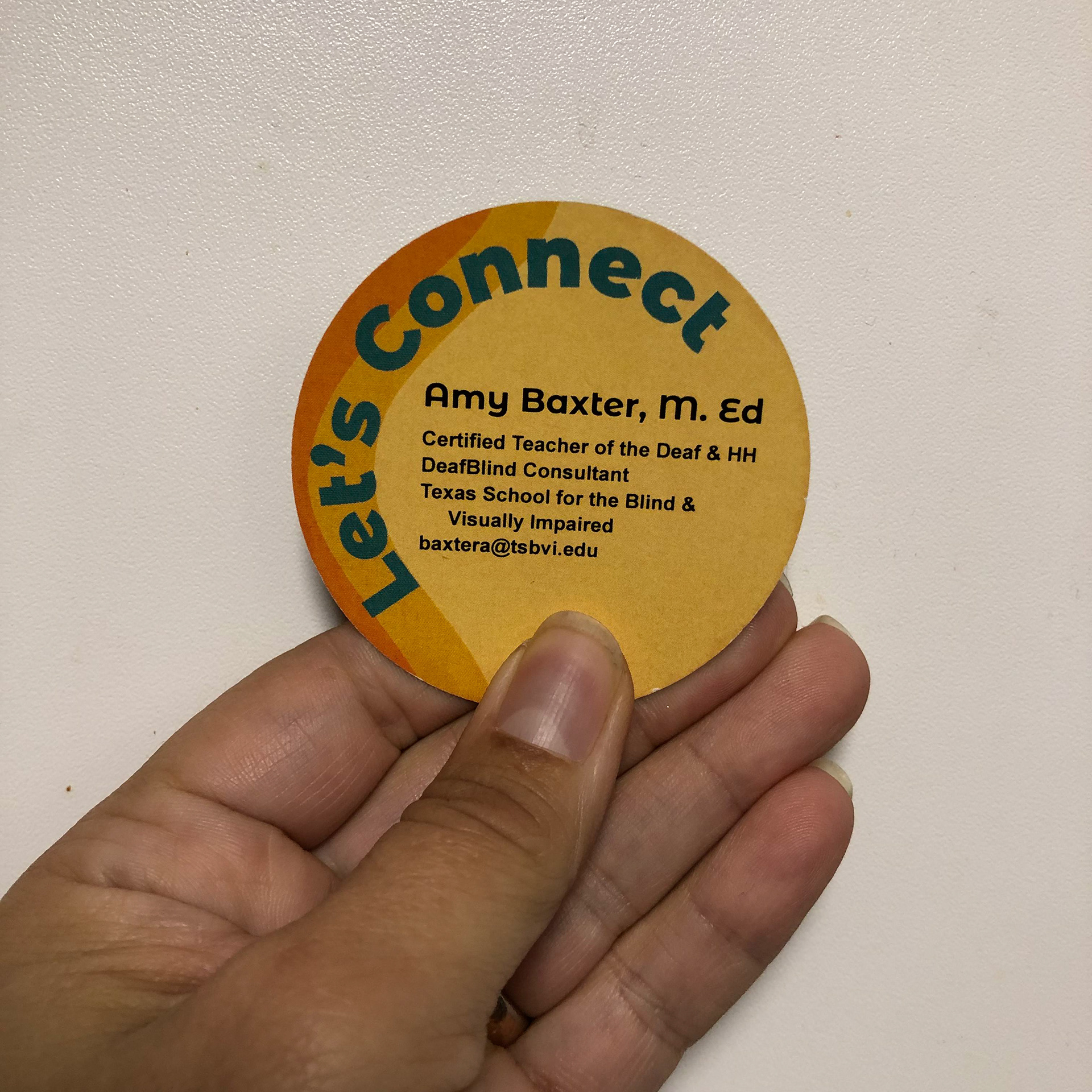
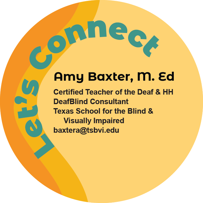
Final Design Logo & Business Card
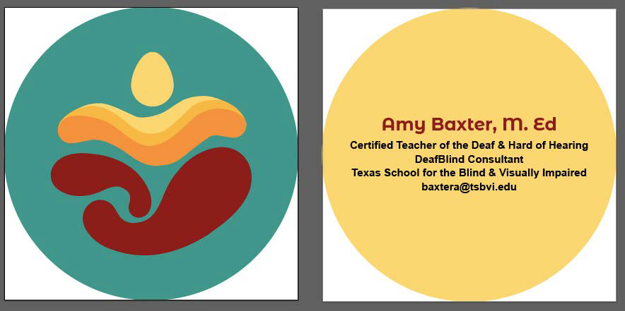
Amy chose and loved how the three toned yellow in thrive was applied on the back side with the aqua blue slogan "Let's Connect" set at 45 degrees, with the contact information inside. Here are the images of the final logo design on a circle business card (3" x 3"). I also included a 360 degree video of the business card showing both sides.
Digital Art - Front
Digital Art - Back
The final product - 360 degree. (FYI, it is printed without the guidelines.)