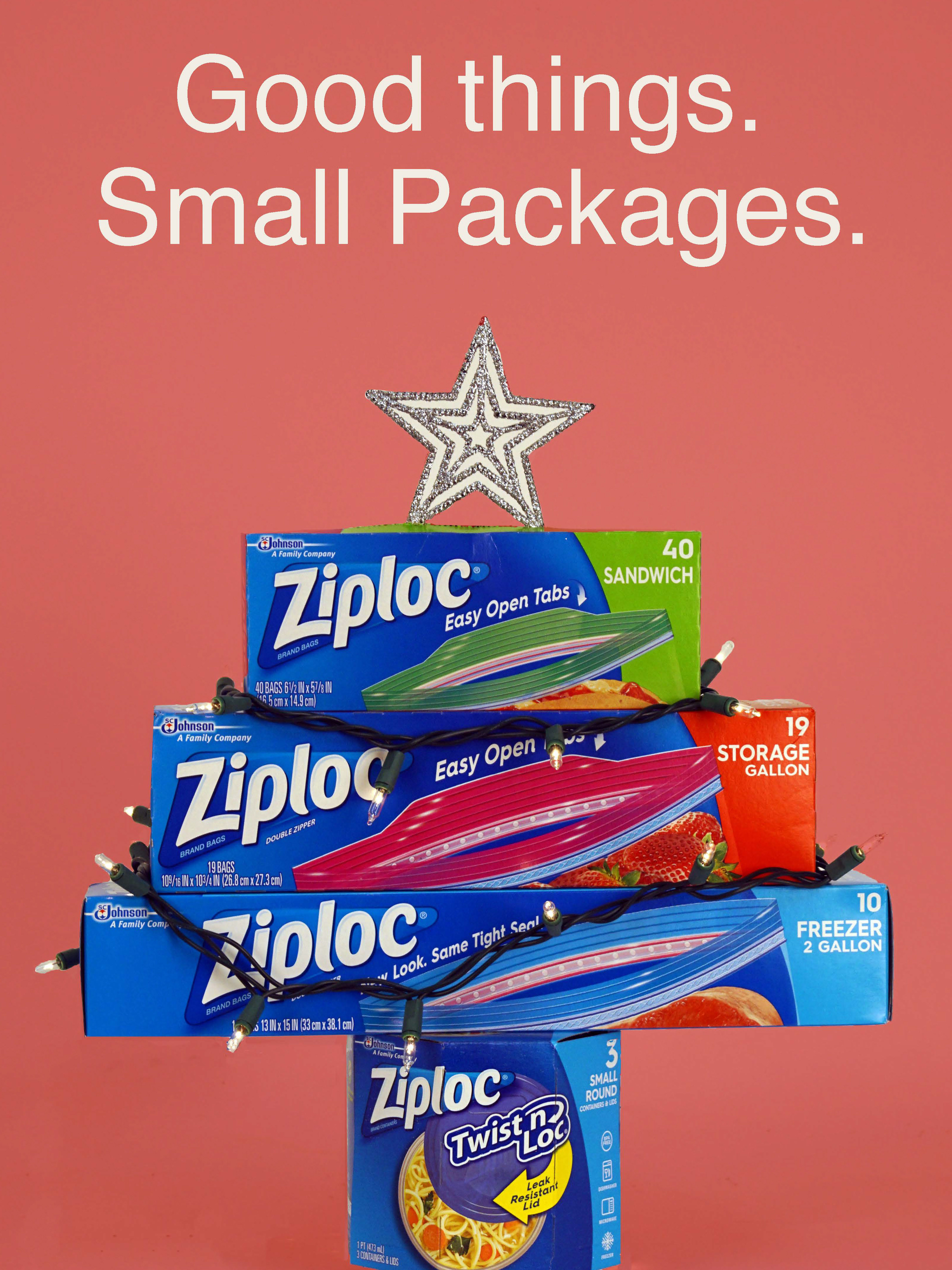

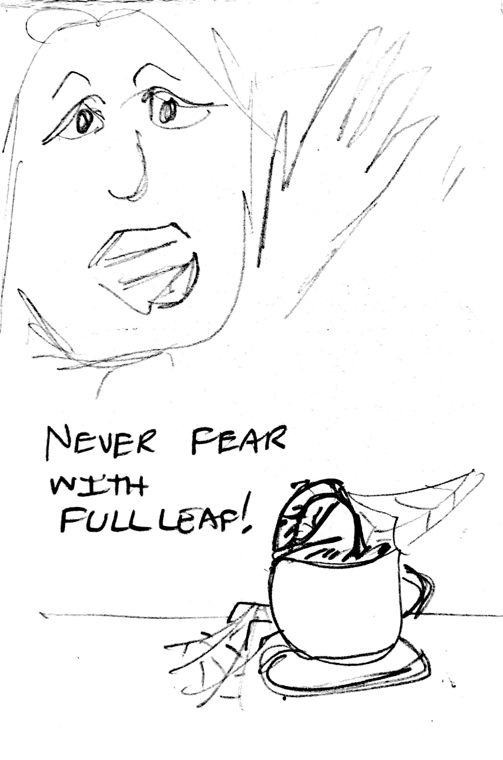
one of marketing ads
Project Overview
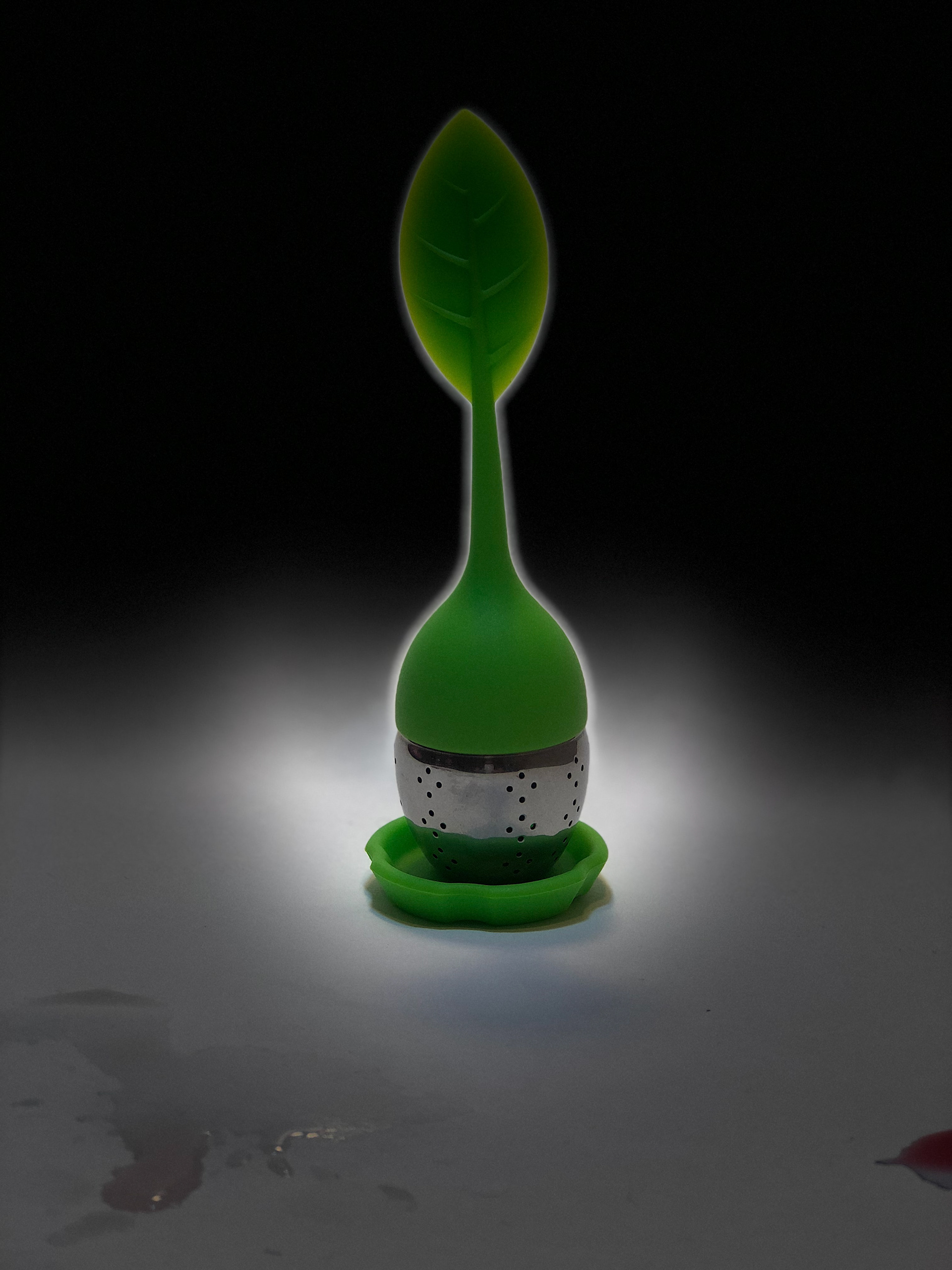
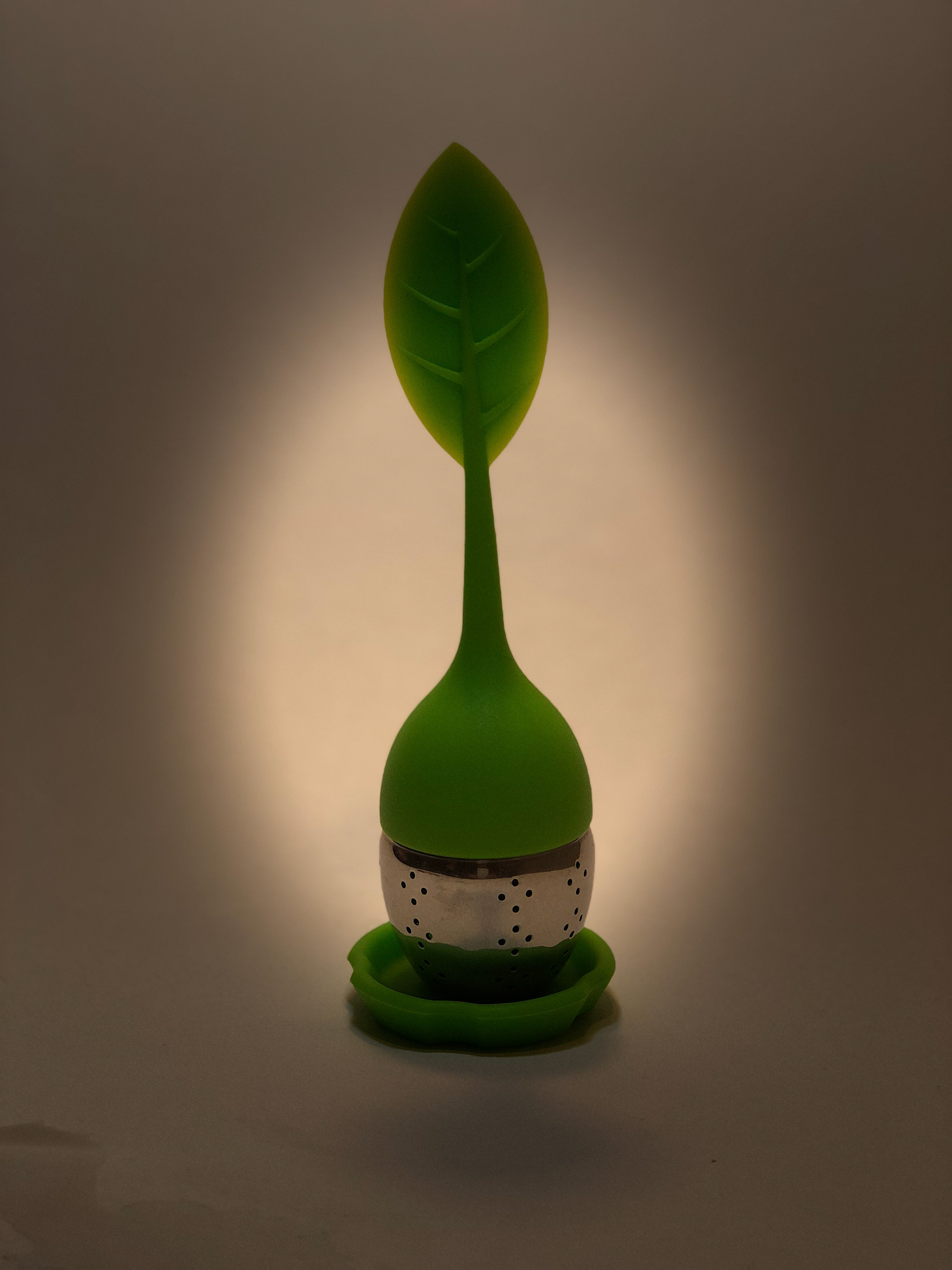
This project was to rebrand or create ads for a company or product of our choice. The chosen product is the tea infuser from the Full Leaf Tea Company. Based on research, Full Leaf is the only one that sells that specific kind of tea infuser; which has a silicone leaf shaped top with the strainer at the bottom. There are potential opportunities for rebranding and improvement on their products, logo and website. Full Leaf does little advertising outside of social media. Social Media ads are decent for an adult or senior citizen audience but do not impact enough on college-aged consumers. For this project, the focus will be on two parts: redesigning the company’s logo and developing print ads targeting young adults and college-aged consumers to become avid tea drinkers.
This project was to rebrand or create ads for a company or product of our choice. The chosen product is the tea infuser from the Full Leaf Tea Company. Based on research, Full Leaf is the only one that sells that specific kind of tea infuser; which has a silicone leaf shaped top with the strainer at the bottom. There are potential opportunities for rebranding and improvement on their products, logo and website. Full Leaf does little advertising outside of social media. Social Media ads are decent for an adult or senior citizen audience but do not impact enough on college-aged consumers. For this project, the focus will be on two parts: redesigning the company’s logo and developing print ads targeting young adults and college-aged consumers to become avid tea drinkers.
Process
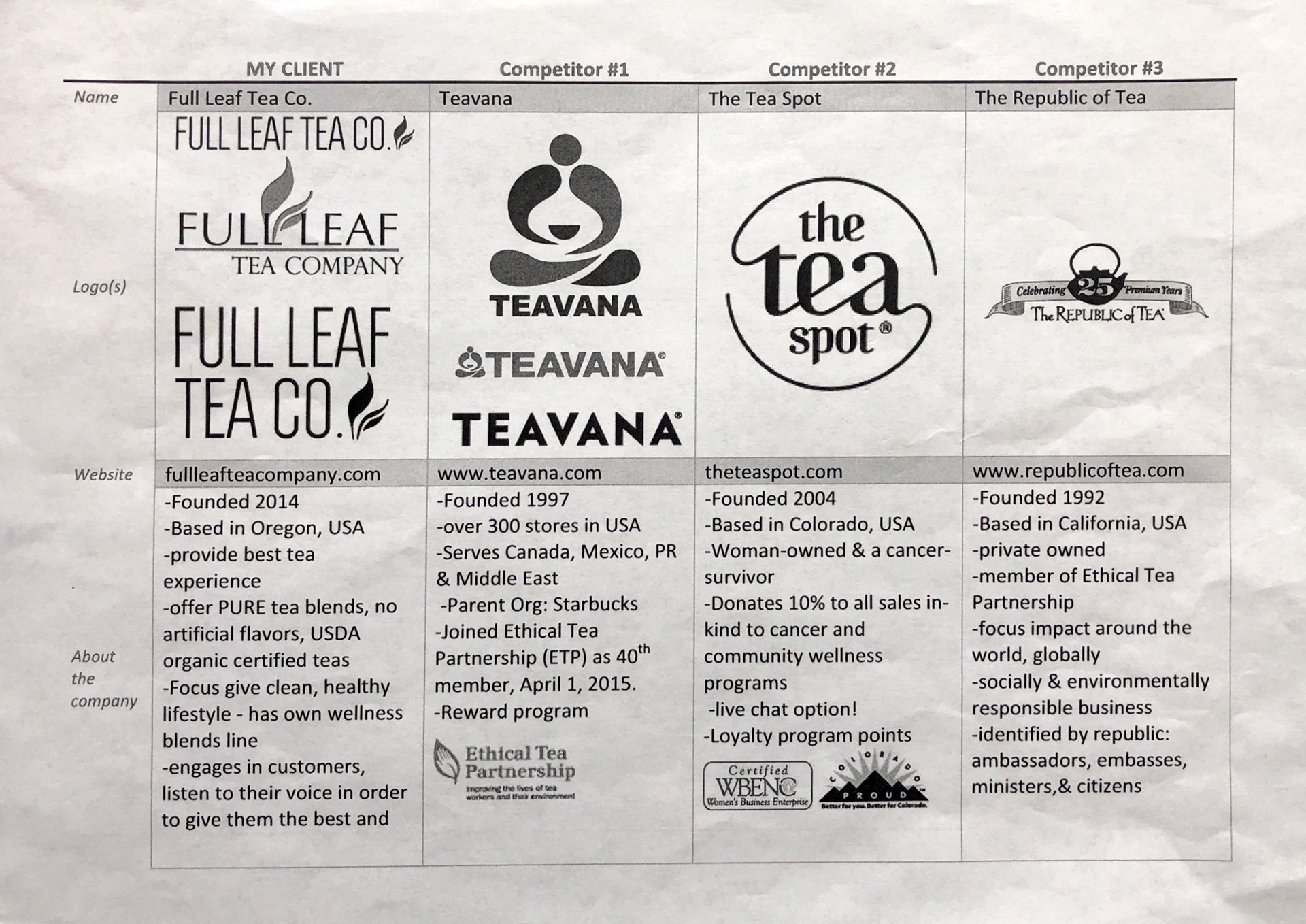
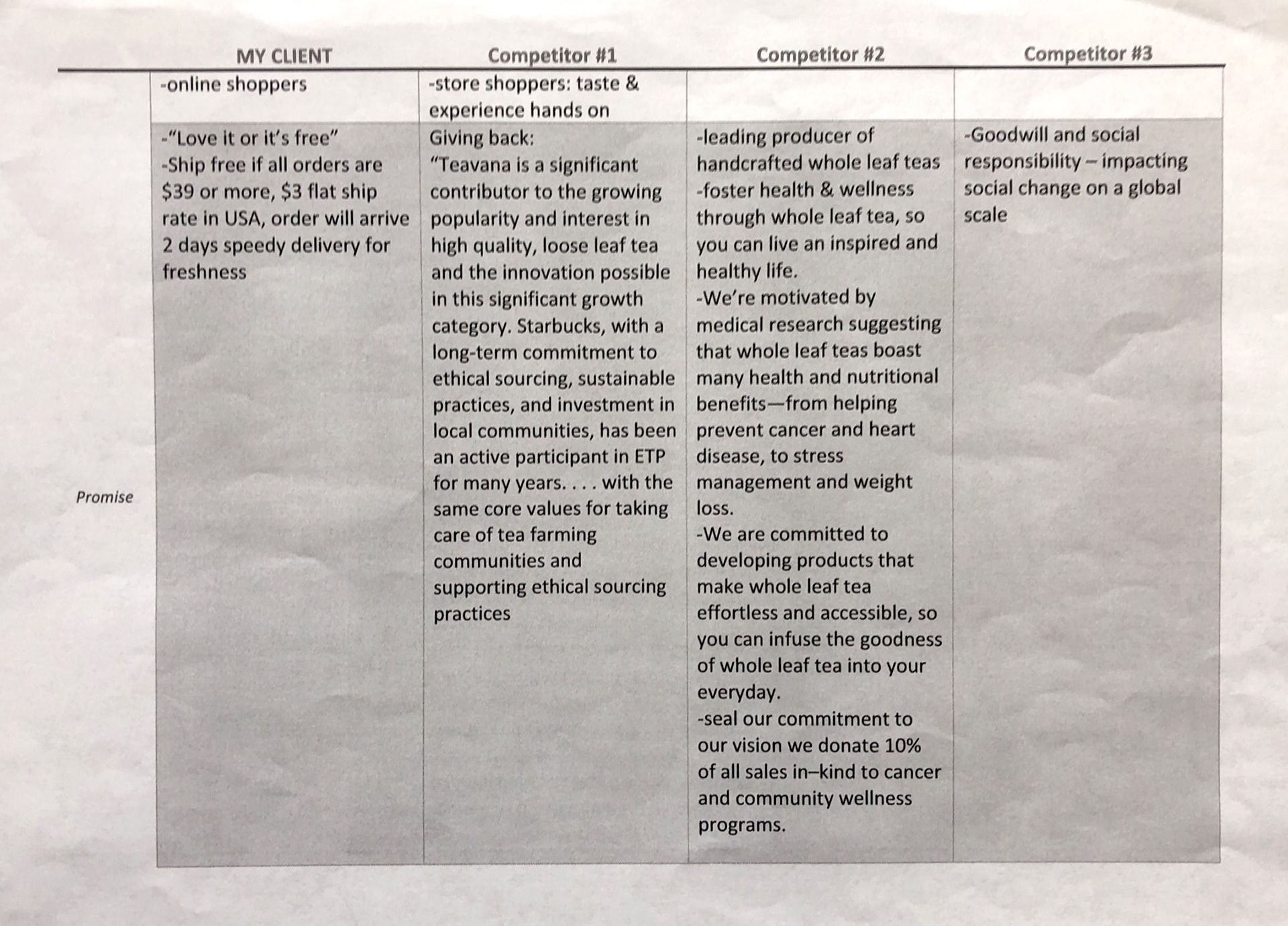
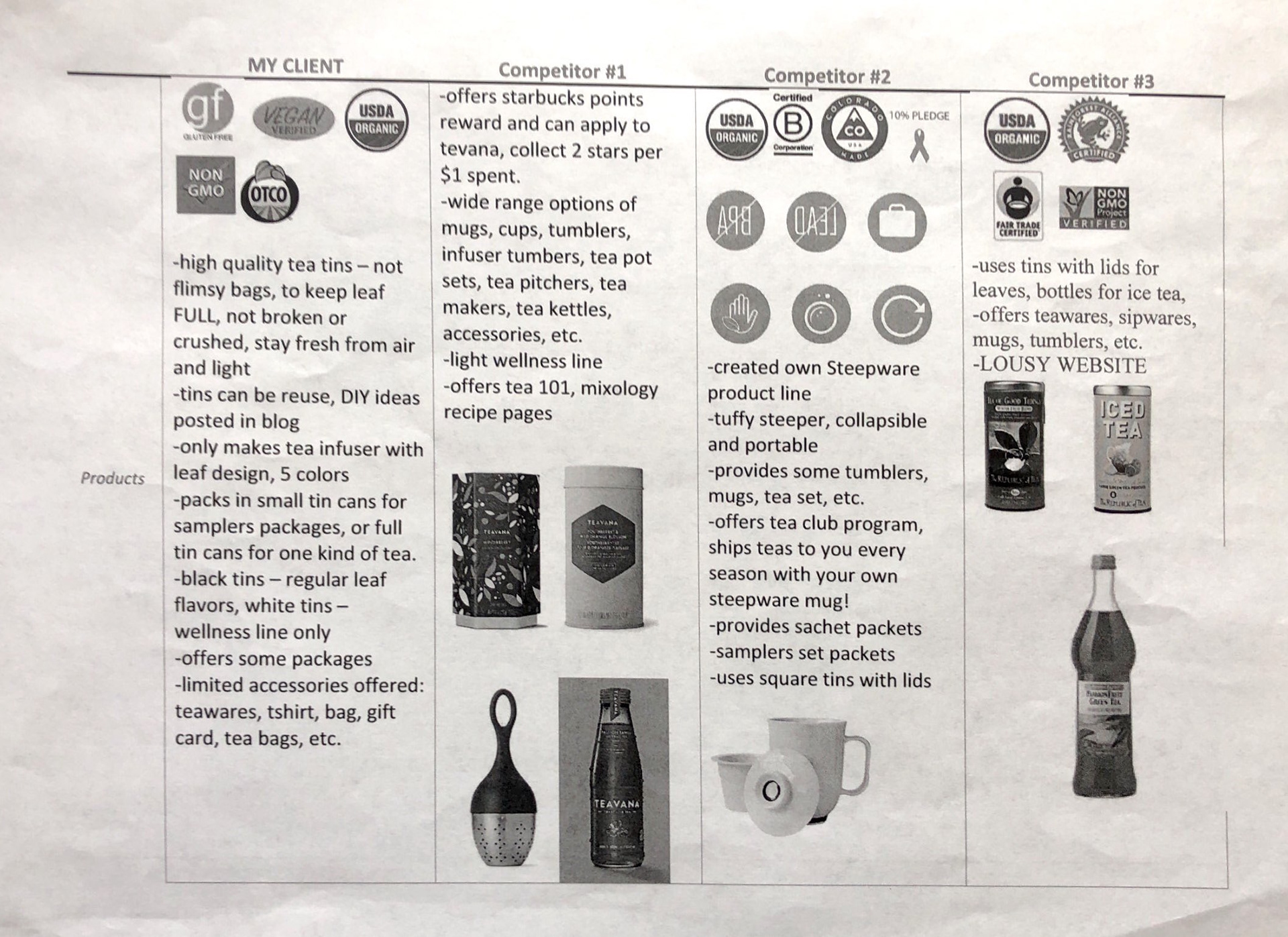
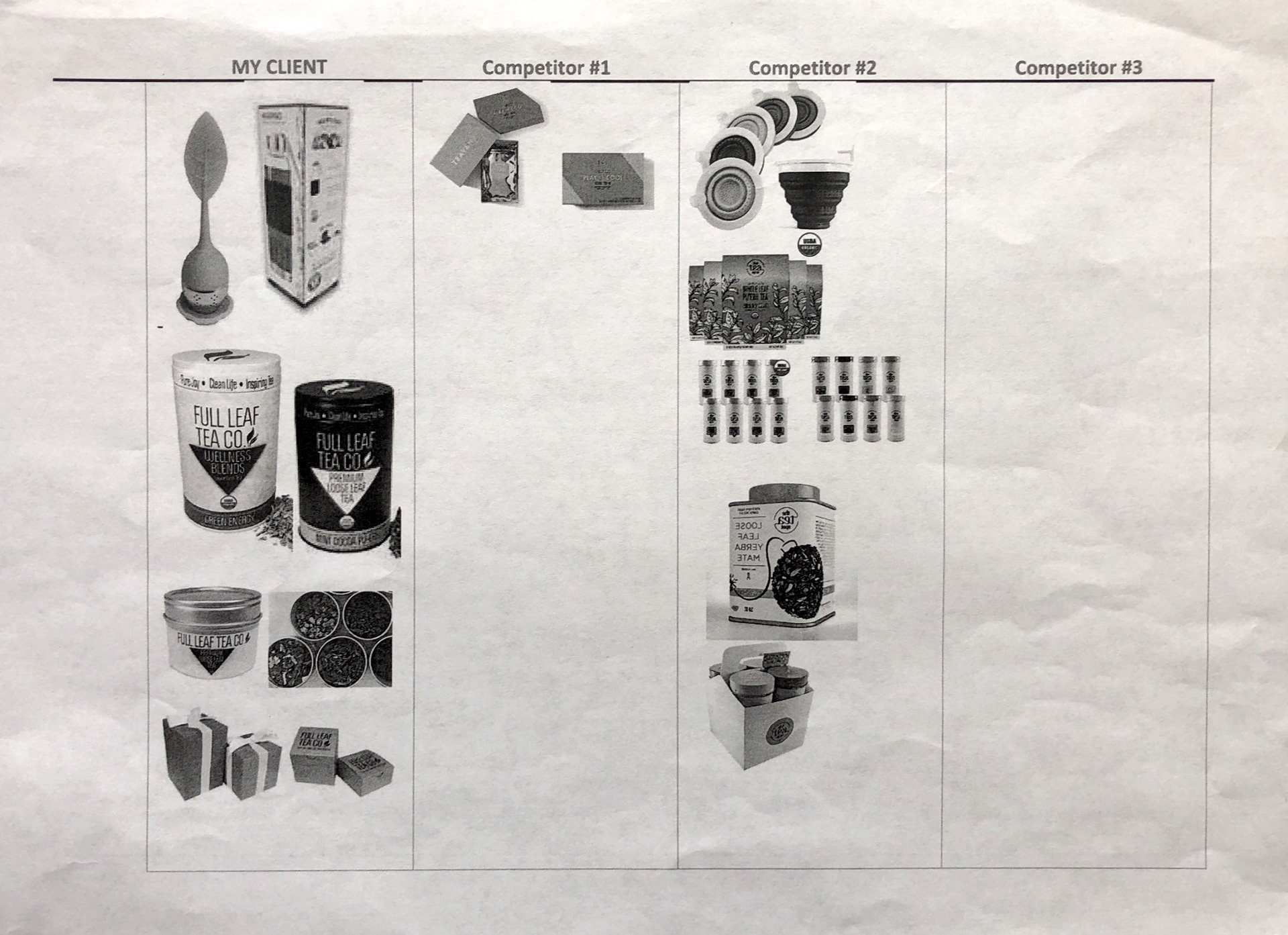
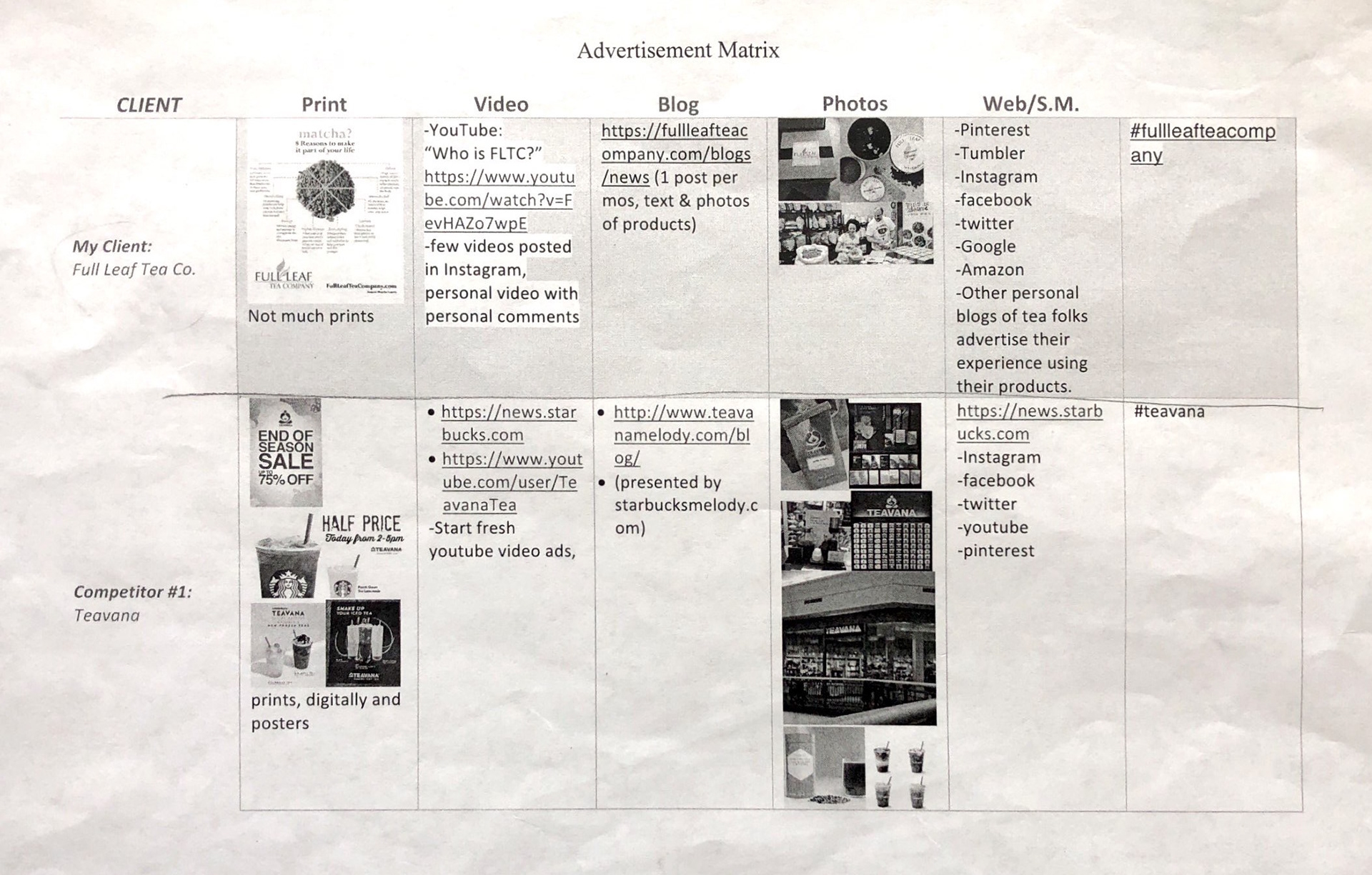
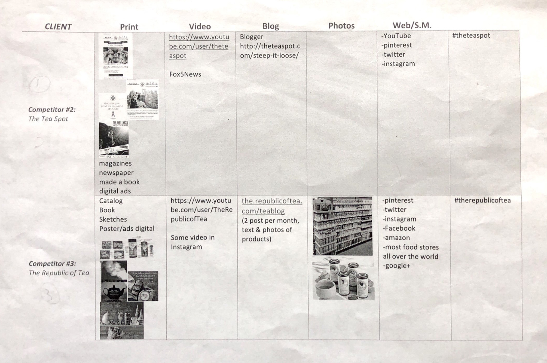
The first step is to research to learn more about the client, Full Leaf Tea Company, and its competitors. There are two kinds of matrixes that were developed for better visual information organization and comparability. The first matrix covered information and details on the client, Full Leaf, and 3 competitors: Teavana, The Tea Spot, and The Republic of Tea. The other matrix listed their advertising and marketing strategies.
The first step is to research to learn more about the client, Full Leaf Tea Company, and its competitors. There are two kinds of matrixes that were developed for better visual information organization and comparability. The first matrix covered information and details on the client, Full Leaf, and 3 competitors: Teavana, The Tea Spot, and The Republic of Tea. The other matrix listed their advertising and marketing strategies.
Below: 6 paged matrix of all tea companies information.
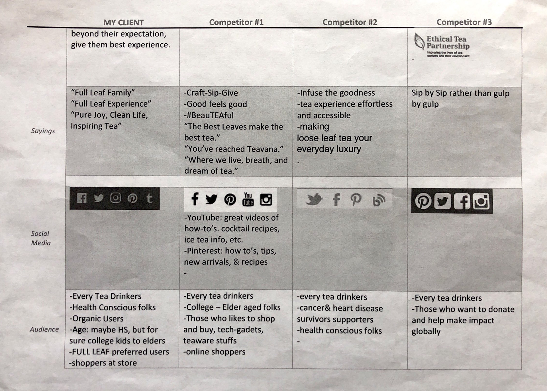
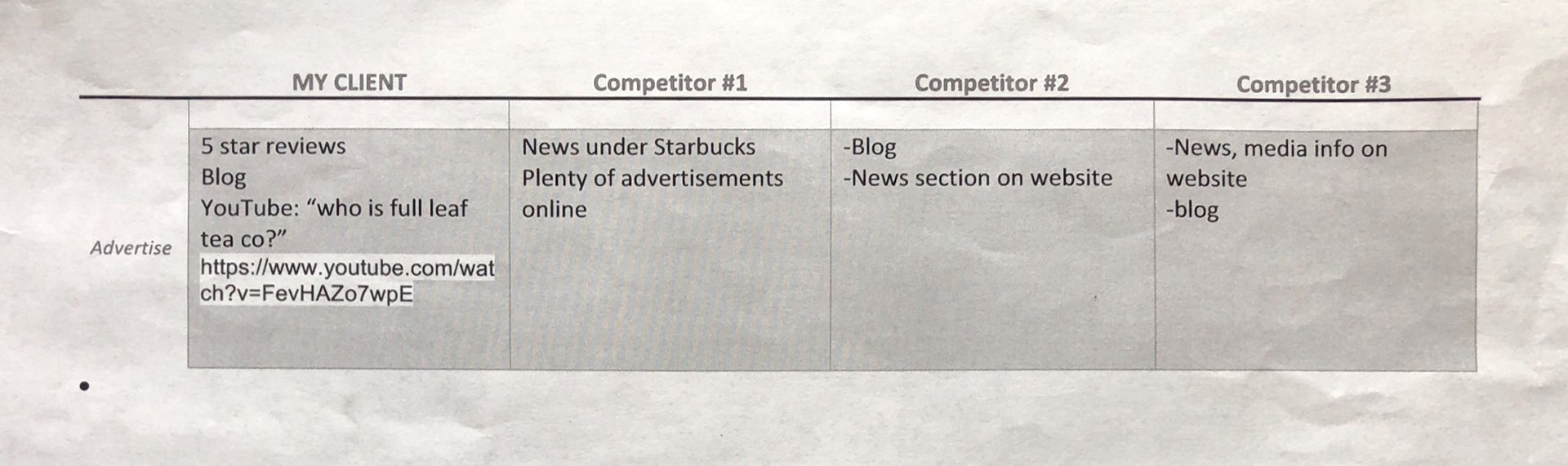
Below: two paged Advertising Information matrix.
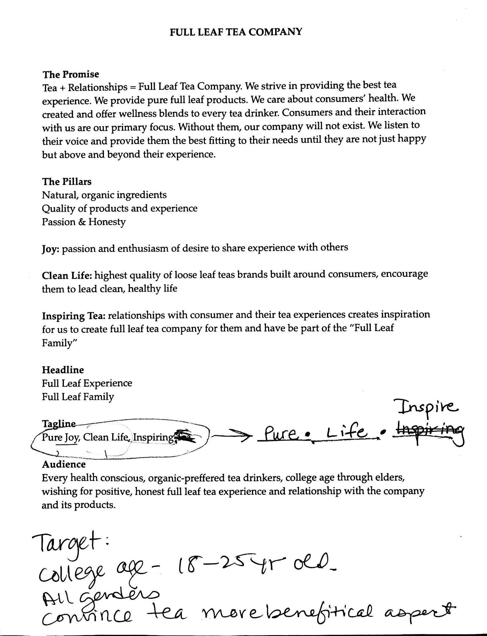
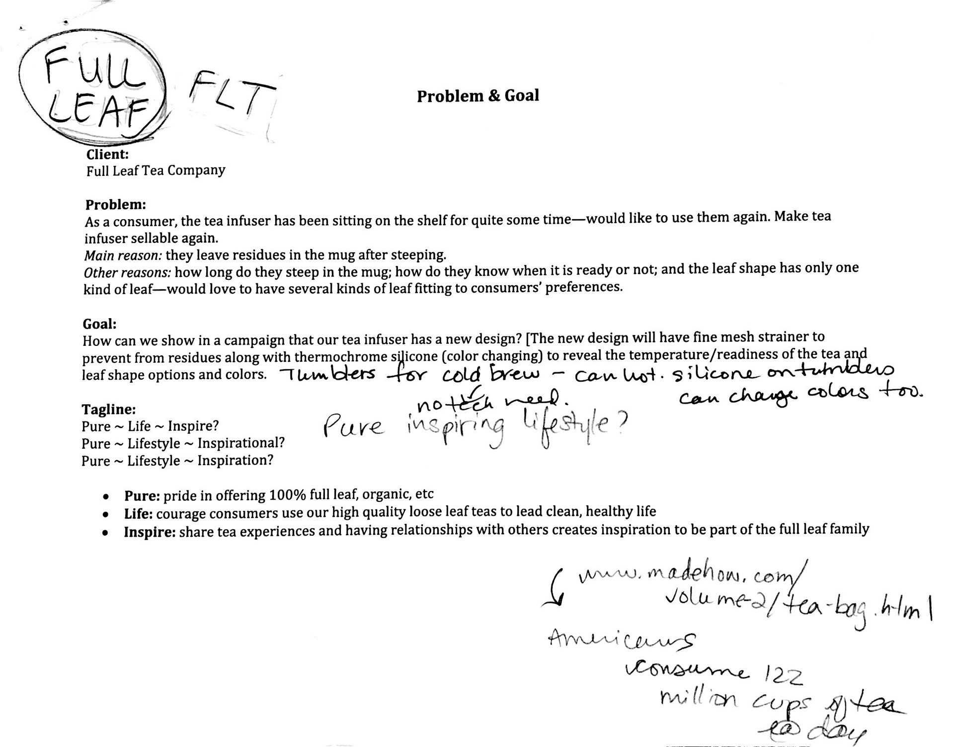
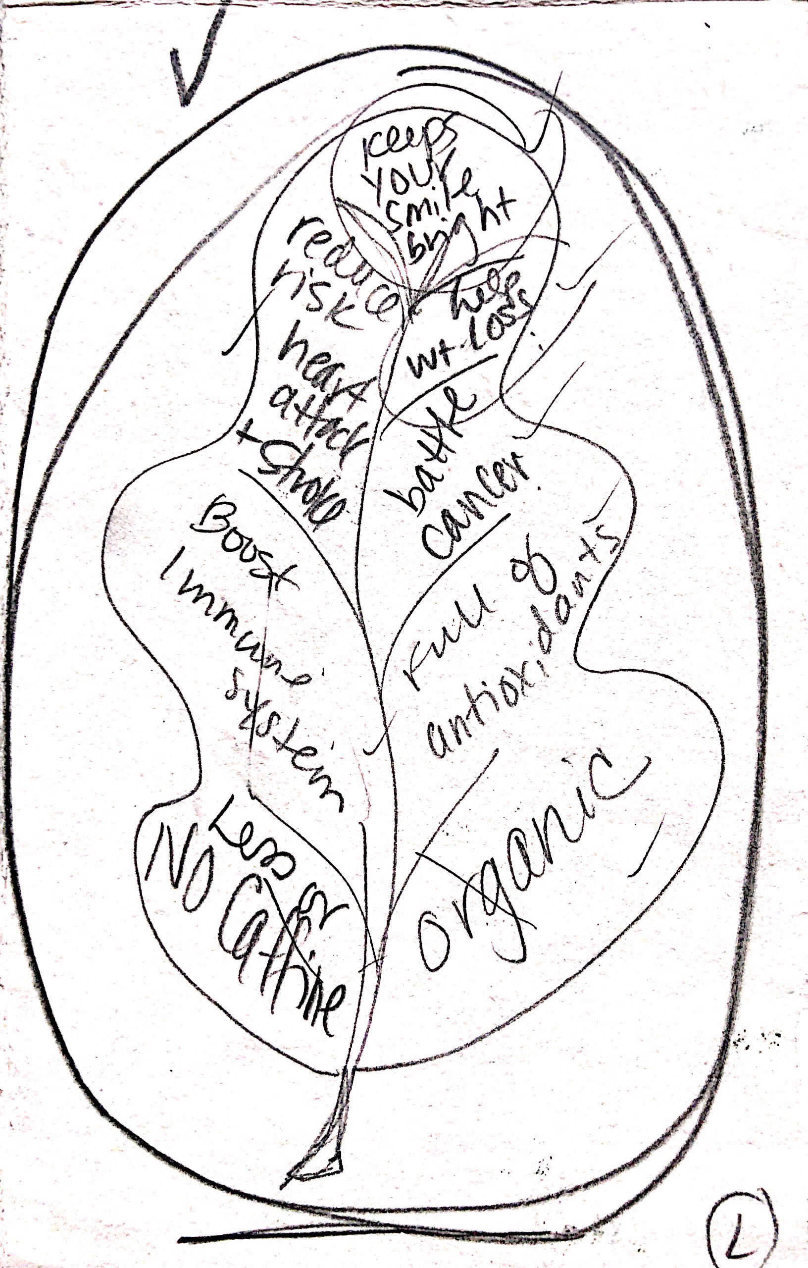
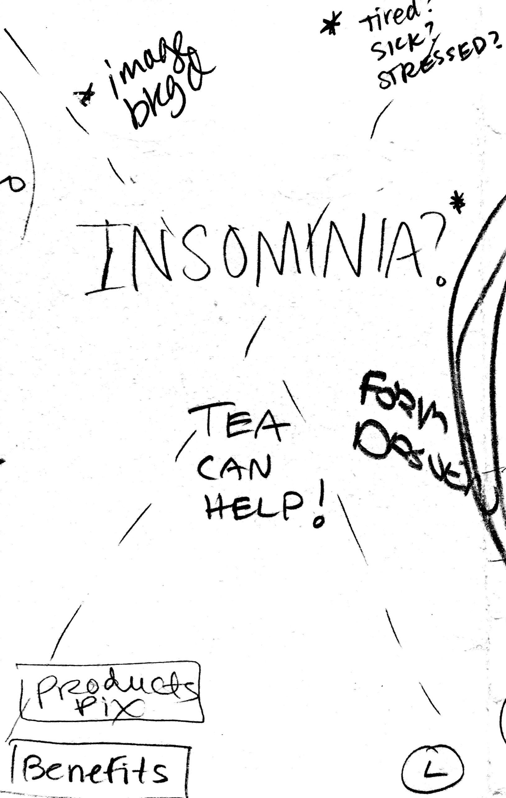
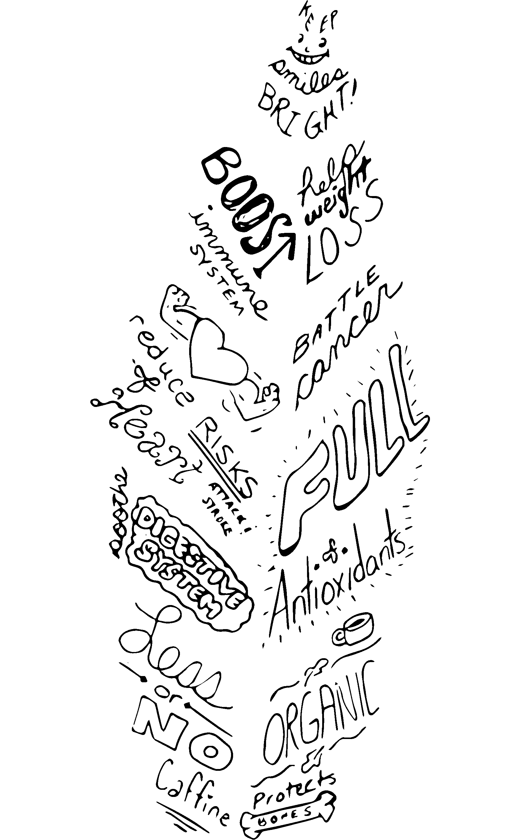
After research, the next step is to analyze and determine Full Leaf’s problems, promises, pillars, headlines, taglines, audience, and set up goals.
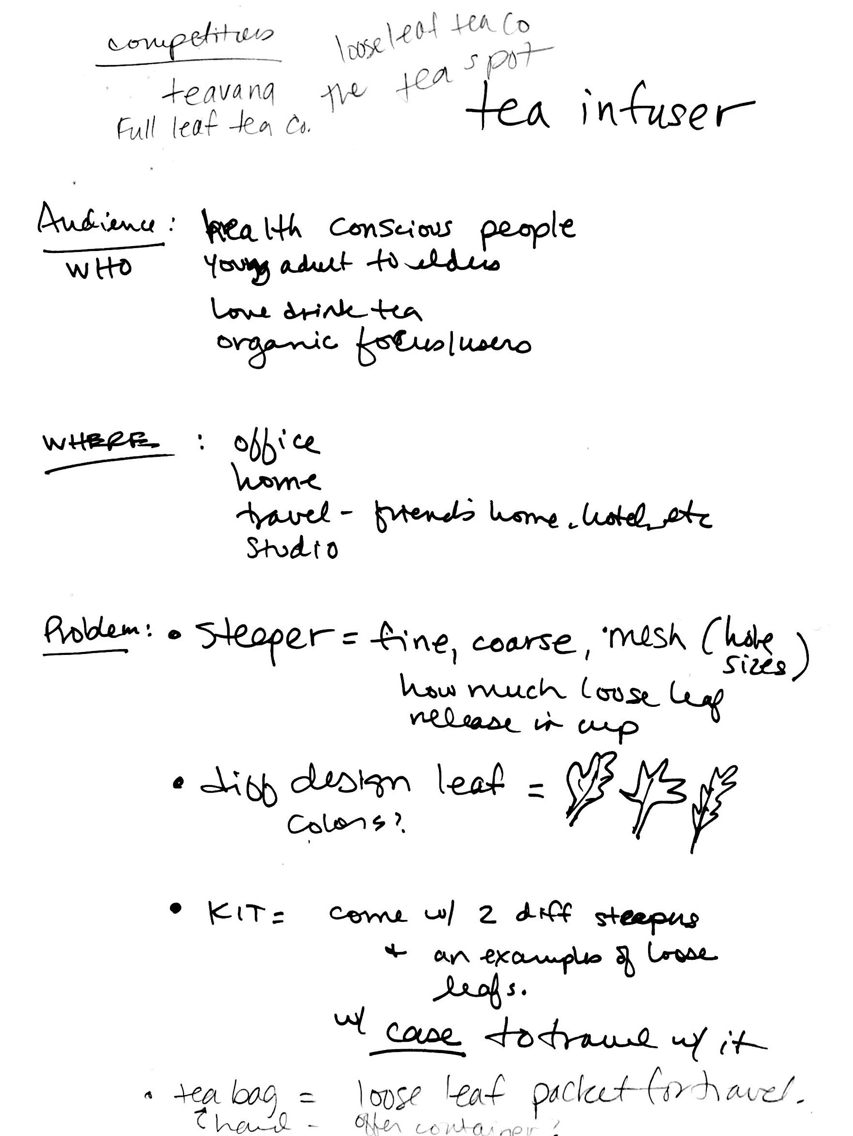
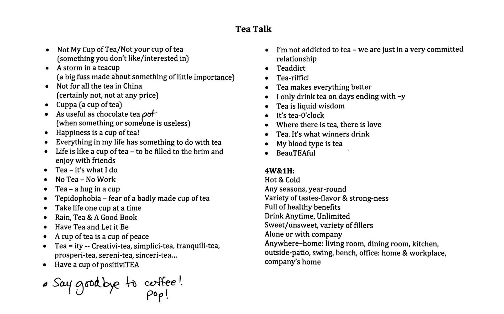
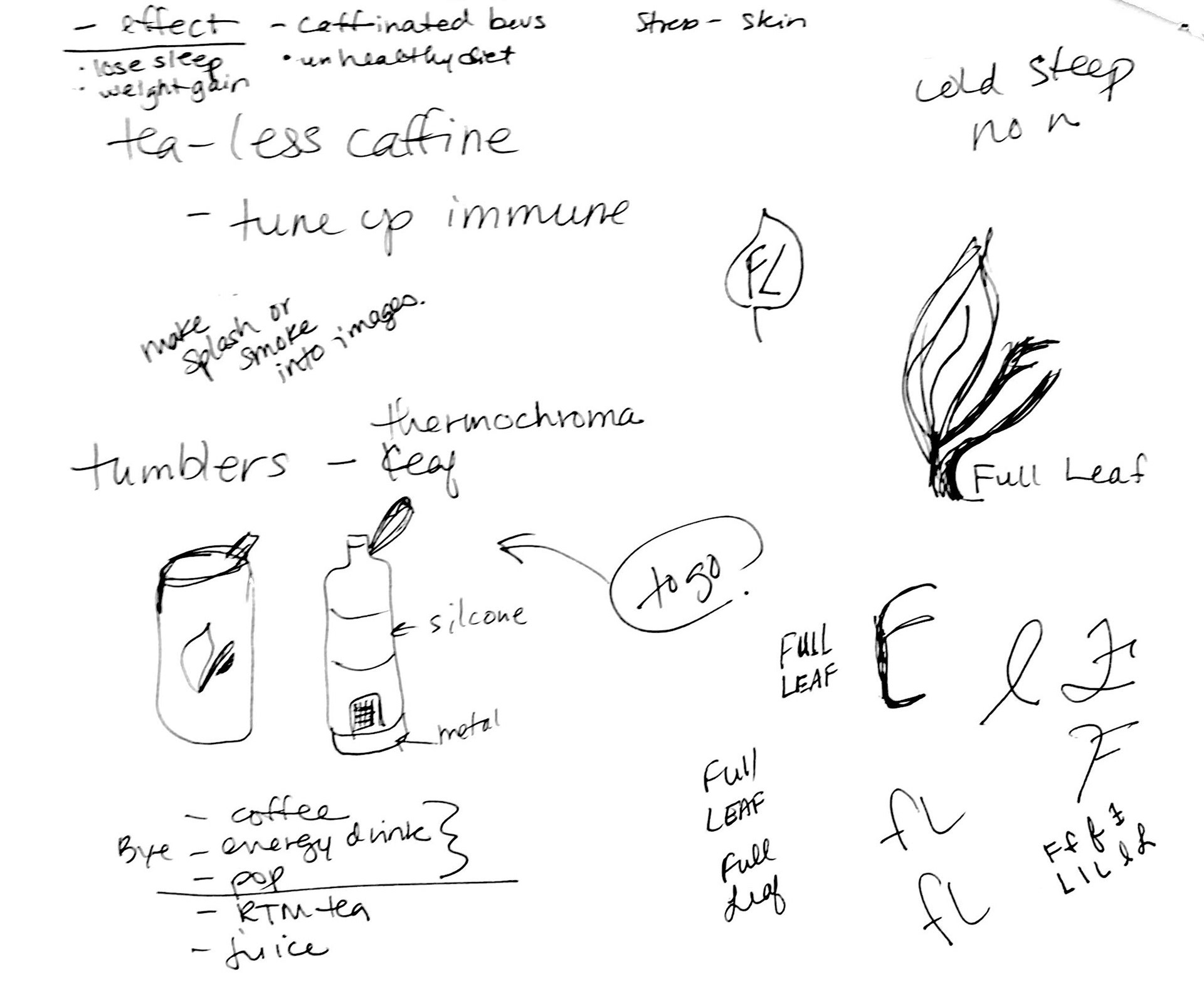
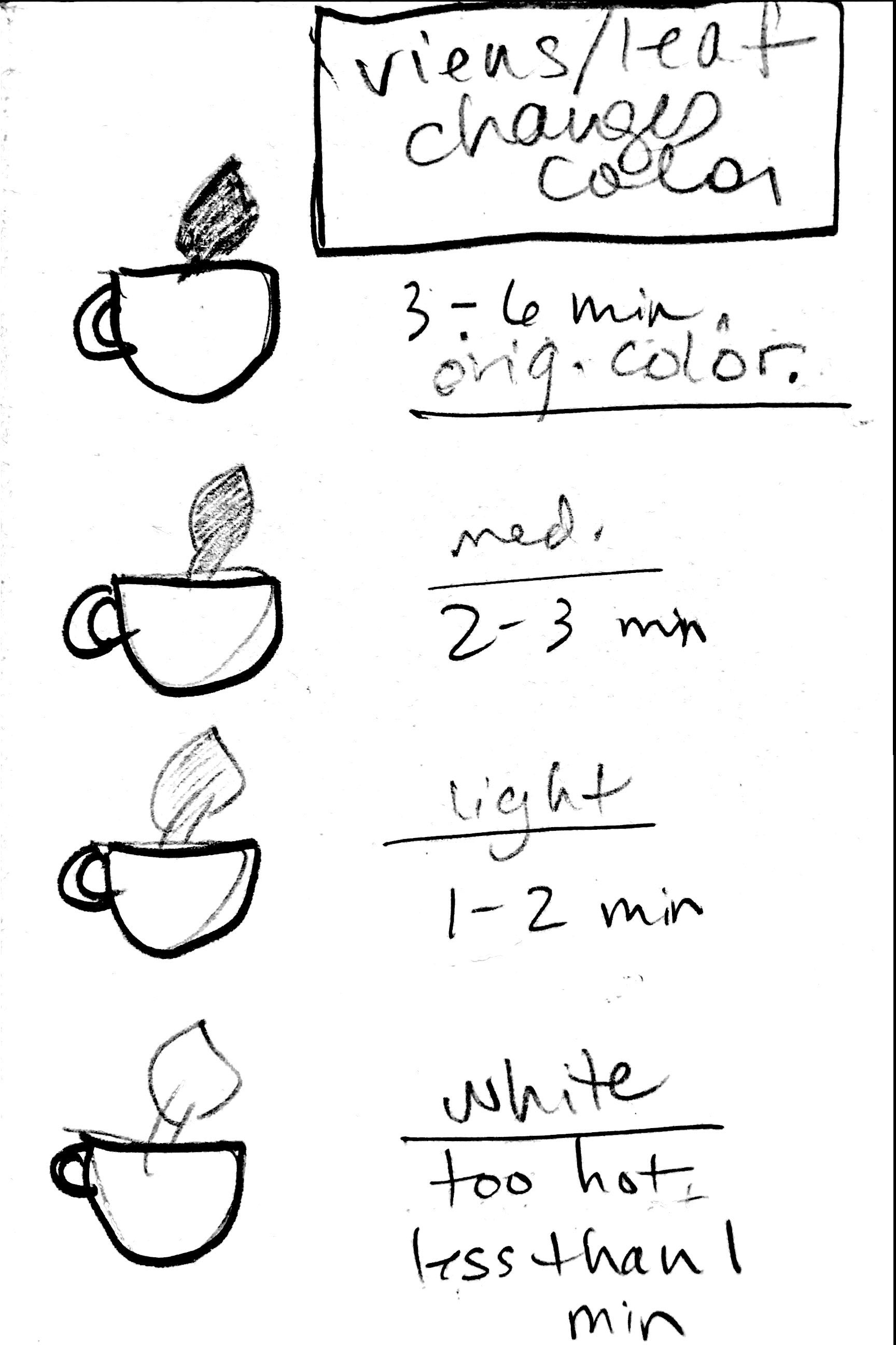
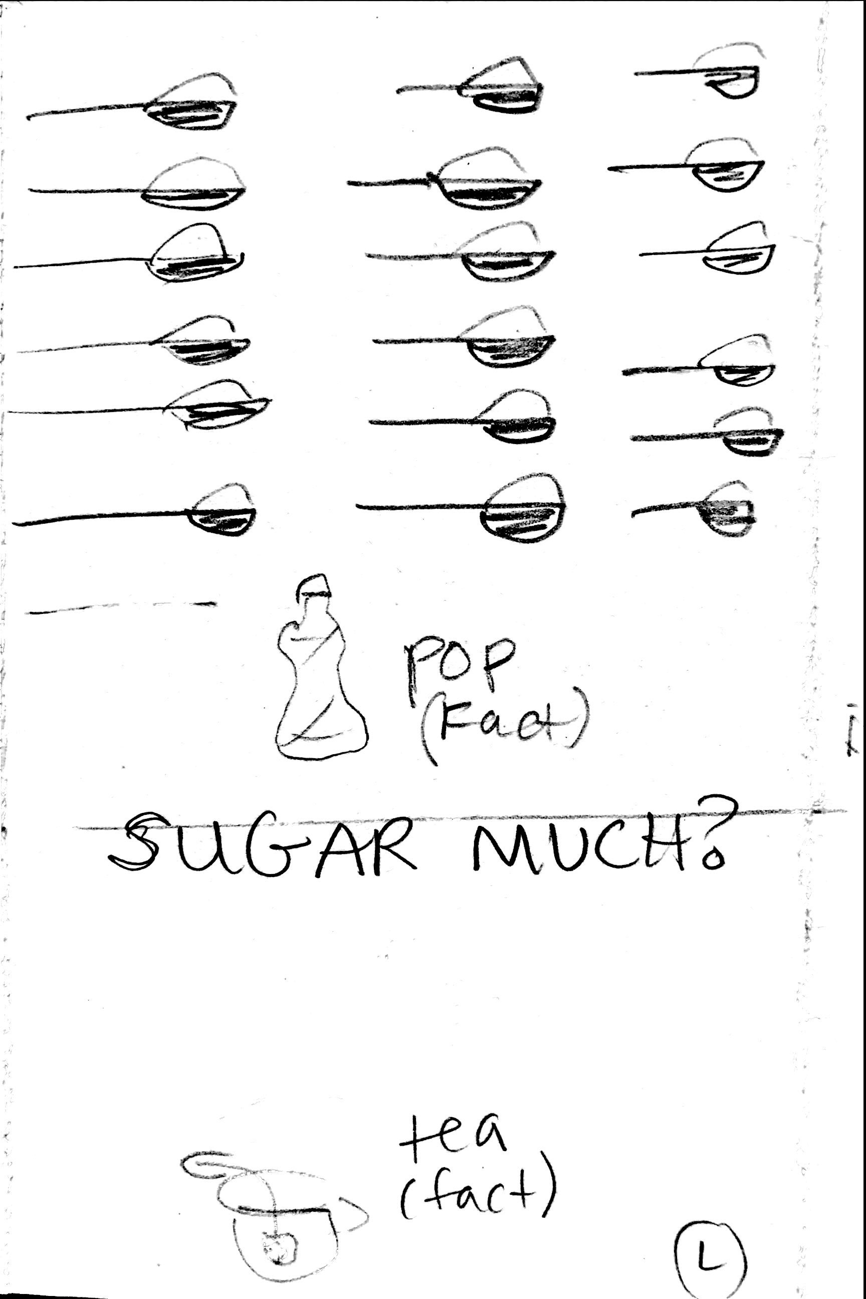
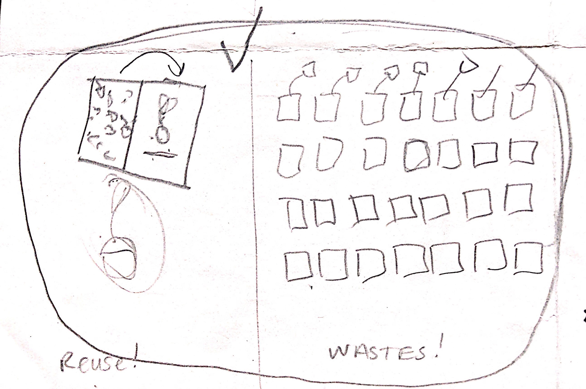
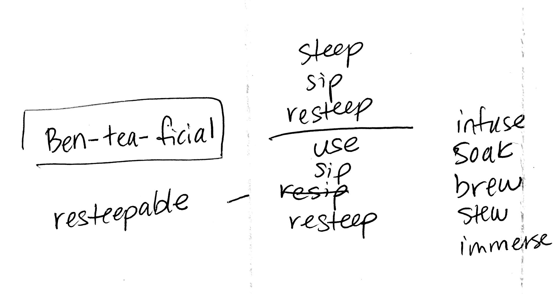
A list of “tea talk” with idioms and common sayings relating to tea has been made in order to come up with ideas for creating ads.
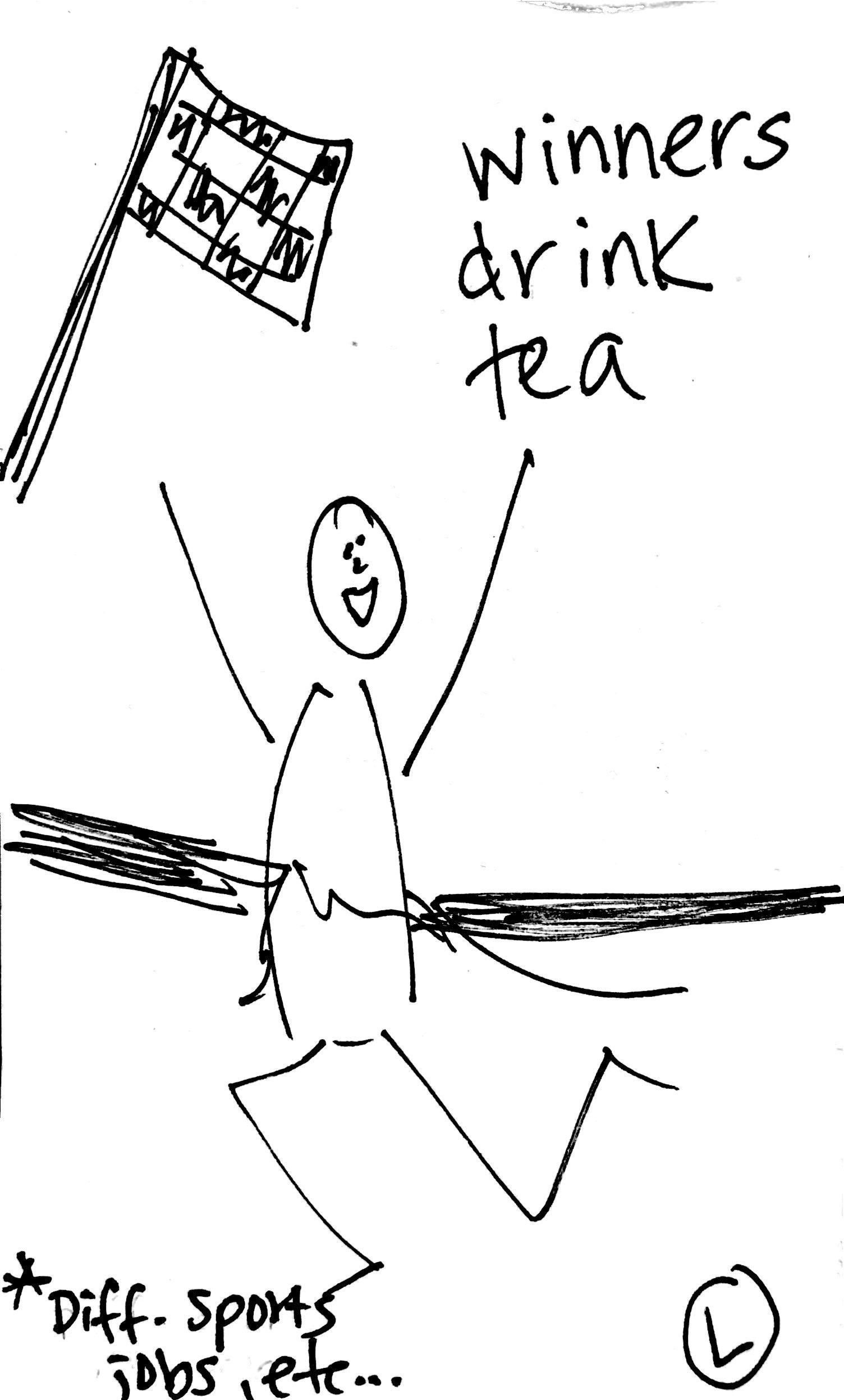
Brainstorming ideas and sketches, including logo, have begun as well.
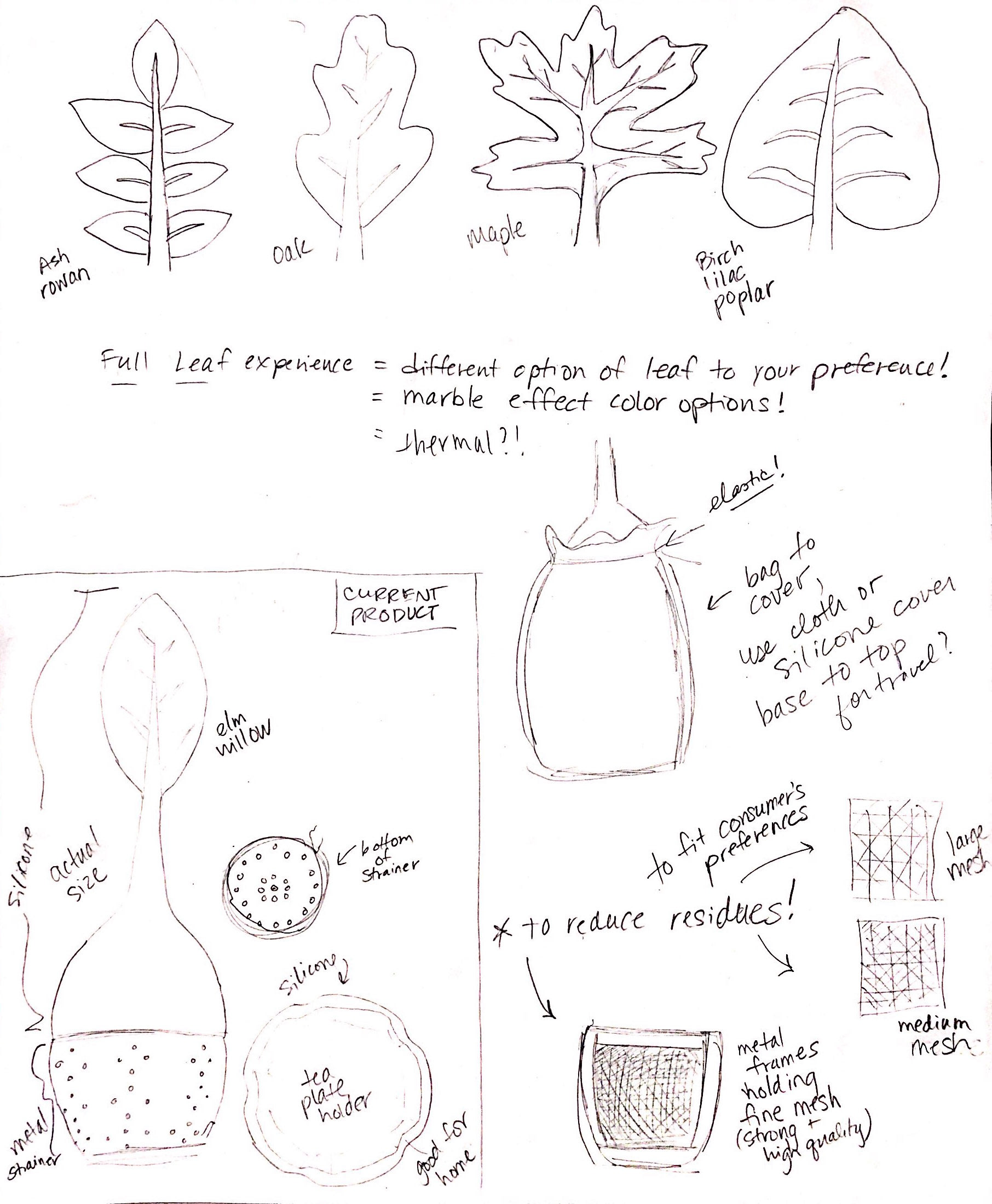

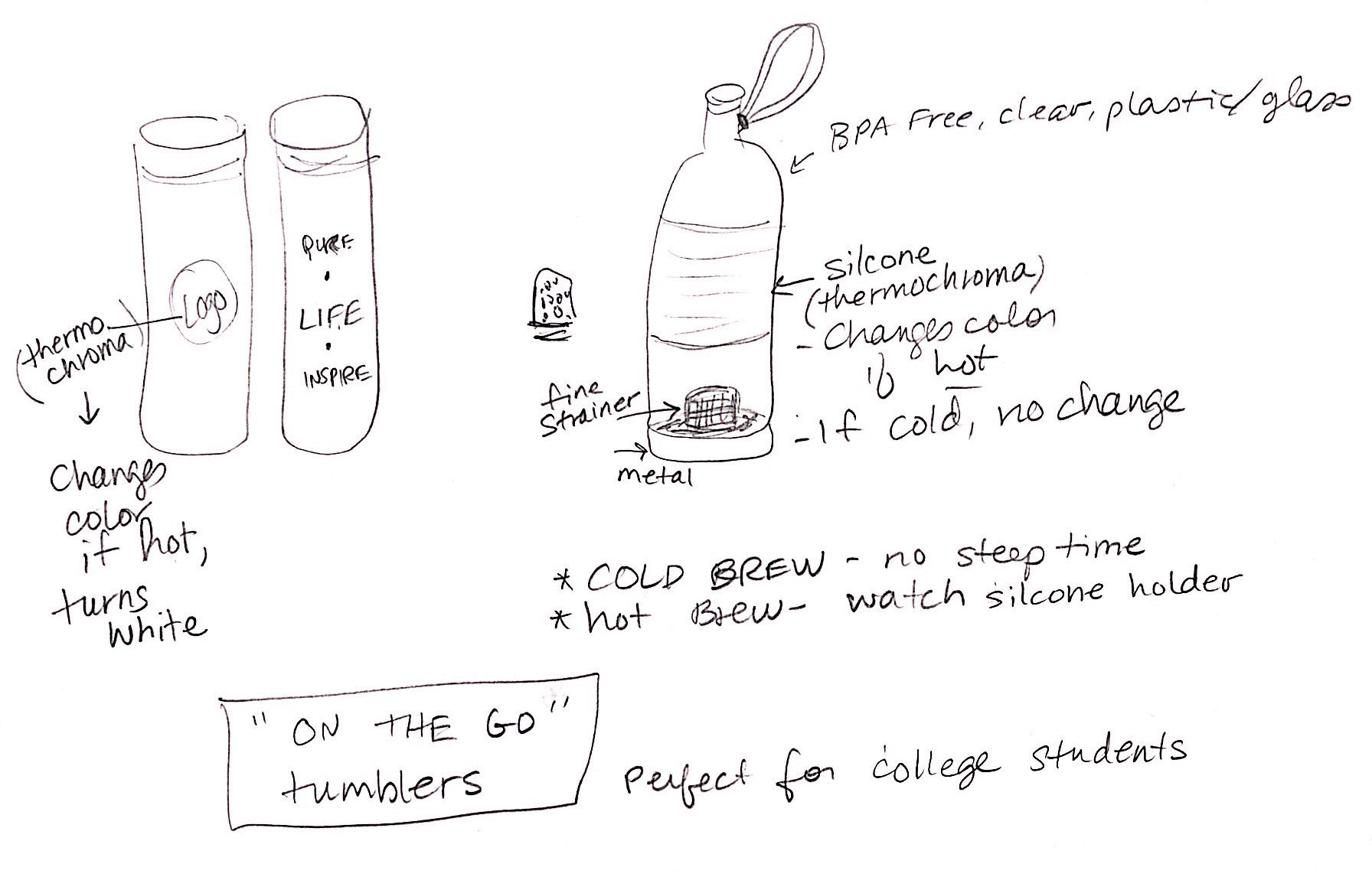
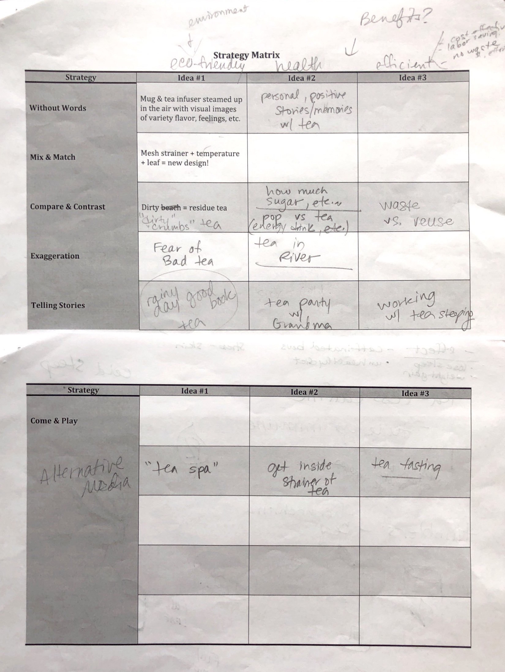
Another matrix was developed as well listing ideas of ads to create with several marketing strategies.
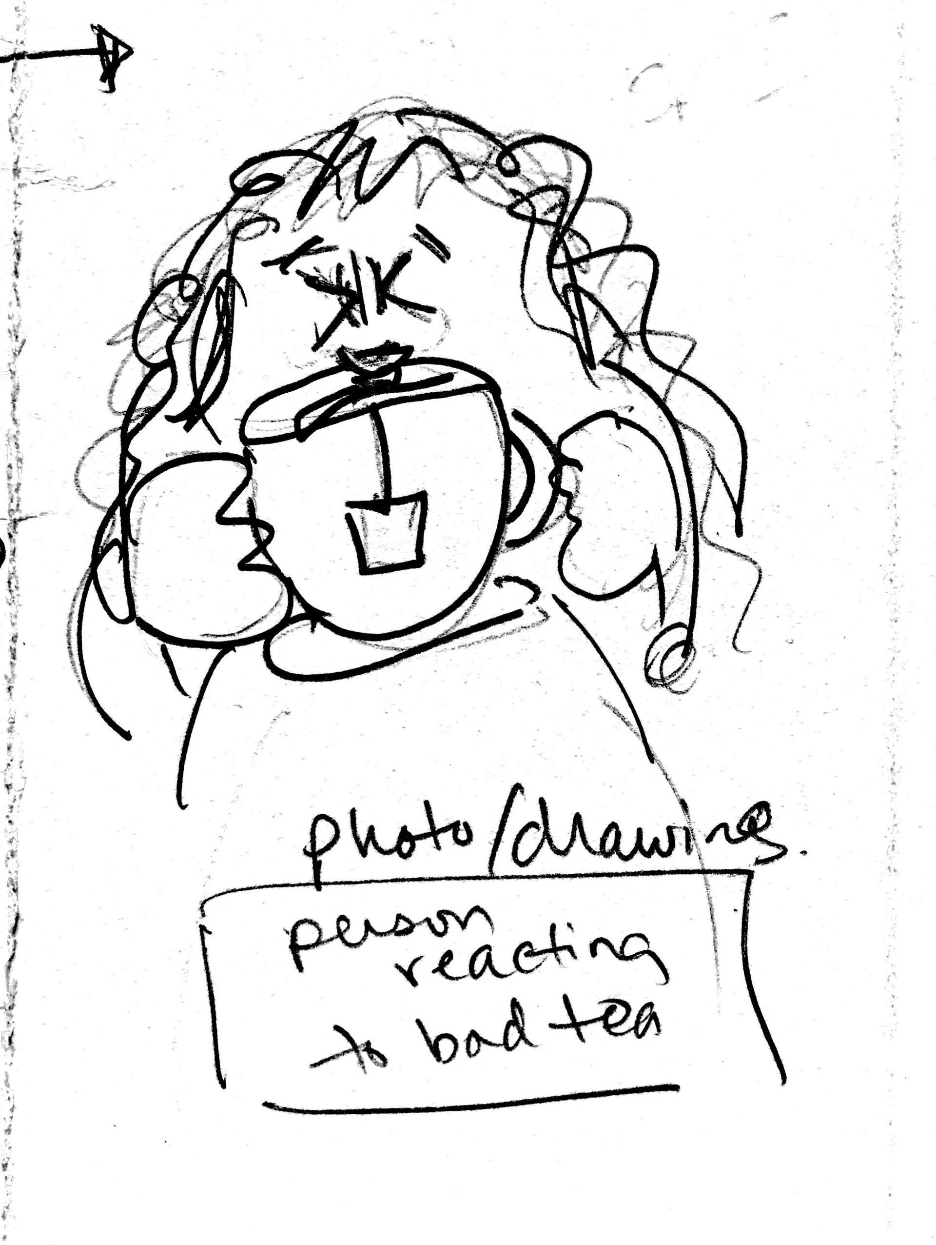
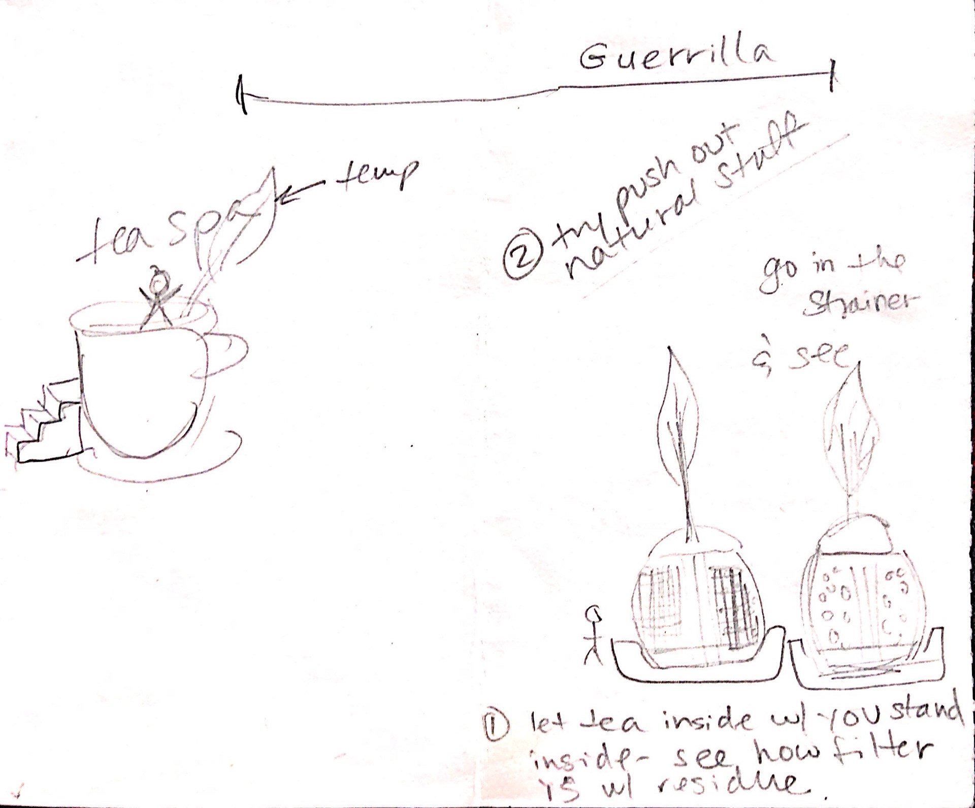
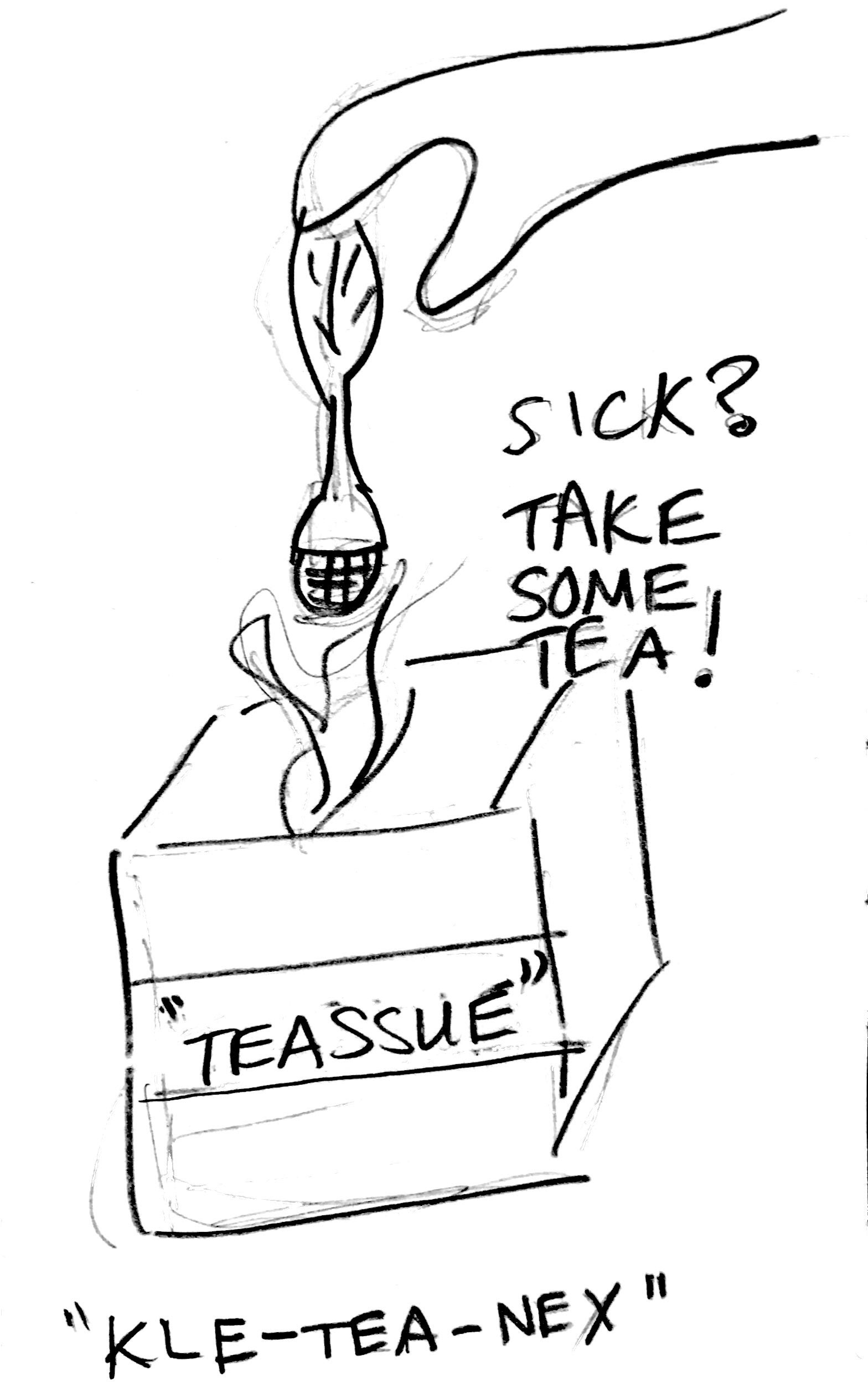
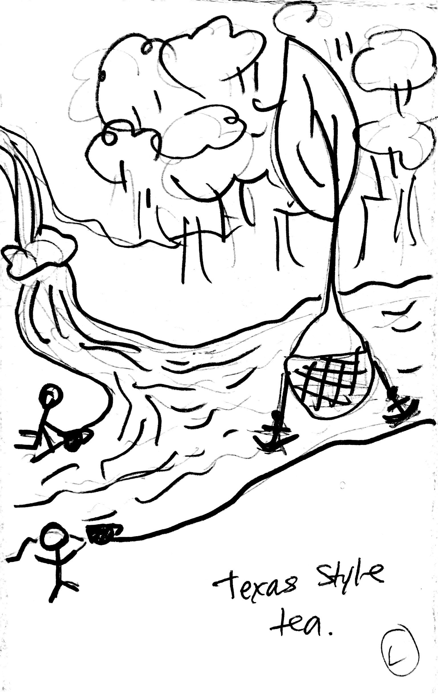
Thumbnails
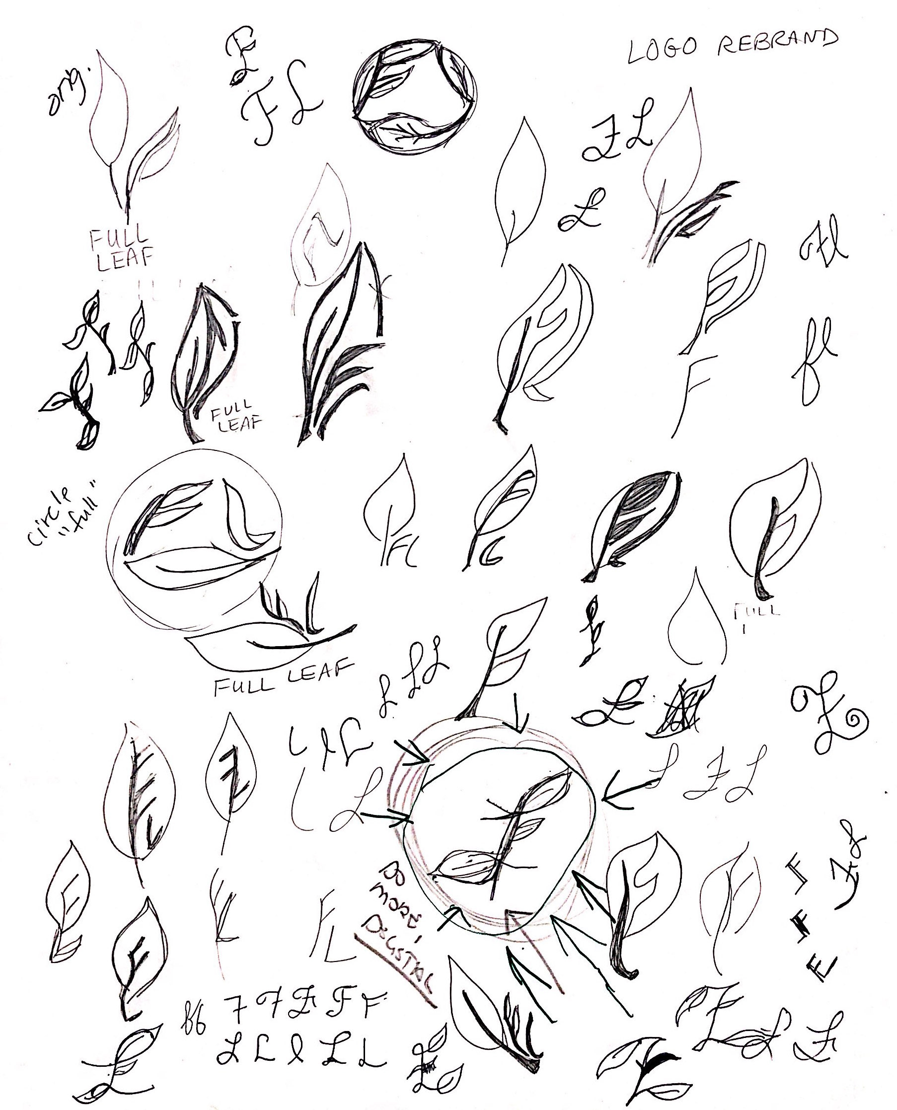
At first, the focus was to redesign the tea infuser itself and general ads. With teacher’s and peers’ feedback and more research, the focus shifted to designing ads with the target audience of college students in mind. This thinking process was impacted through thumbnails and more notes. Again, the possibilities are infinite but with the time limit for this project, the decision was finalized to redesign the logo and create ads. Out of all thumbnails sketched, my teacher, who acted as art director, chose the three circle marks to design ads.
At first, the focus was to redesign the tea infuser itself and general ads. With teacher’s and peers’ feedback and more research, the focus shifted to designing ads with the target audience of college students in mind. This thinking process was impacted through thumbnails and more notes. Again, the possibilities are infinite but with the time limit for this project, the decision was finalized to redesign the logo and create ads. Out of all thumbnails sketched, my teacher, who acted as art director, chose the three circle marks to design ads.

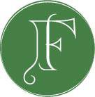
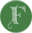
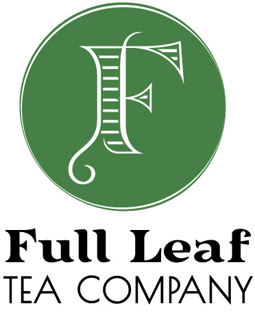
The Logo
The ads needed to have logos to identify the company; therefore, the process started from sketches to digital roughs, and then the final design. The logo was designed in Adobe Illustrator. Full Leaf’s original logo is more text based than the image itself. The image is beautiful but the text takes over the attention. Often consumers will recognize and remember an image-based logo rather than text. The decision was made to create the new logo design more simply “FL” (Full Leaf for short) incorporated an image with a youthful feel to capture a young audience. Once the new logo was finalized, it was placed on the ads usually at the bottom corner, in one color tone and some opacity.
The ads needed to have logos to identify the company; therefore, the process started from sketches to digital roughs, and then the final design. The logo was designed in Adobe Illustrator. Full Leaf’s original logo is more text based than the image itself. The image is beautiful but the text takes over the attention. Often consumers will recognize and remember an image-based logo rather than text. The decision was made to create the new logo design more simply “FL” (Full Leaf for short) incorporated an image with a youthful feel to capture a young audience. Once the new logo was finalized, it was placed on the ads usually at the bottom corner, in one color tone and some opacity.
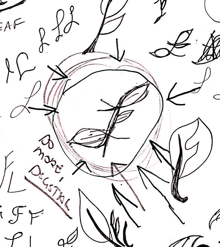
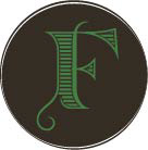
From the full page of logo sketches below, the circled logo was chosen by my art director teacher.
Here are images of several digital rough changes to the final design of the new logo.
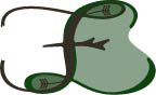


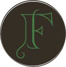

The original logo is included for visual comparison with the final logo.

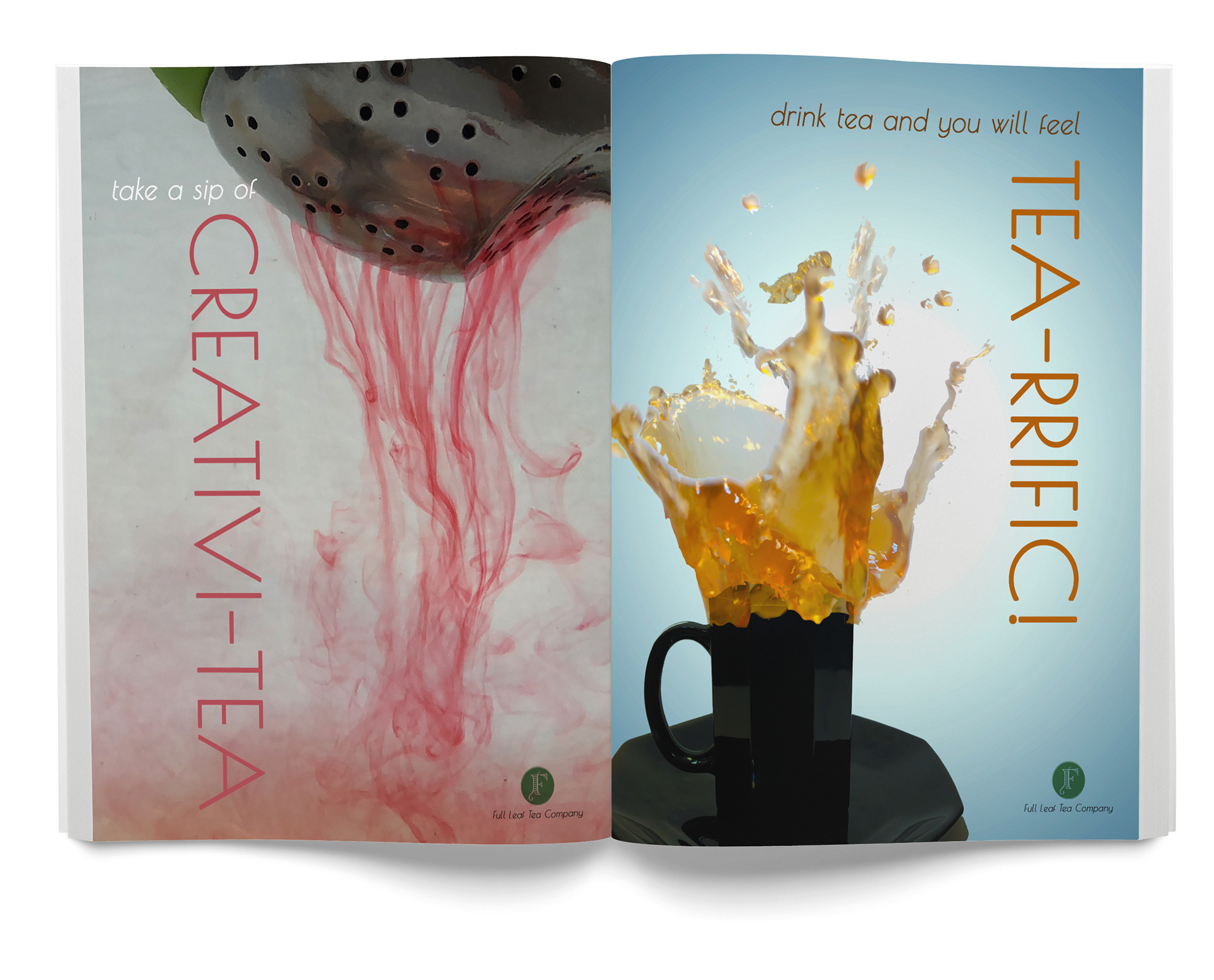
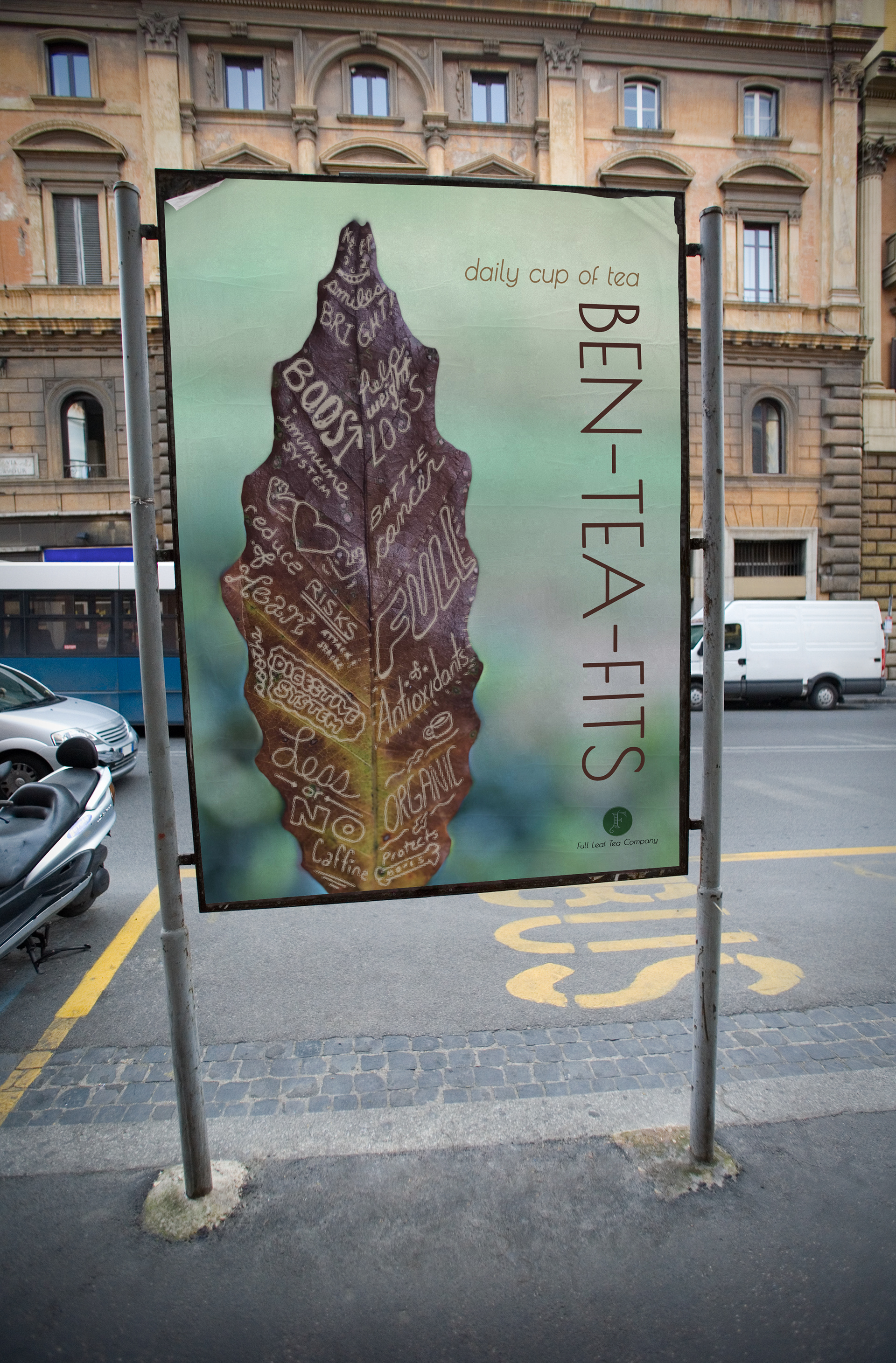
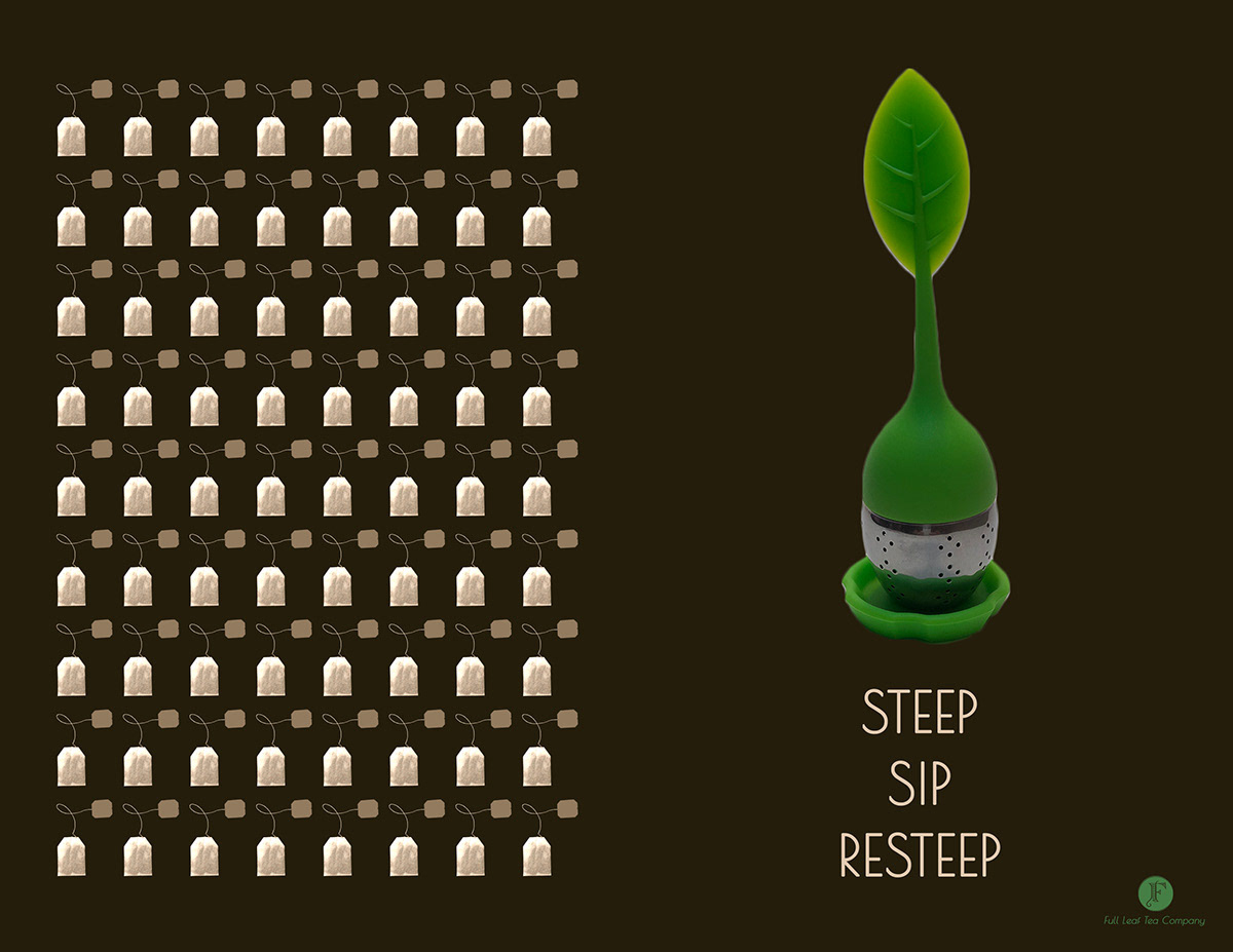
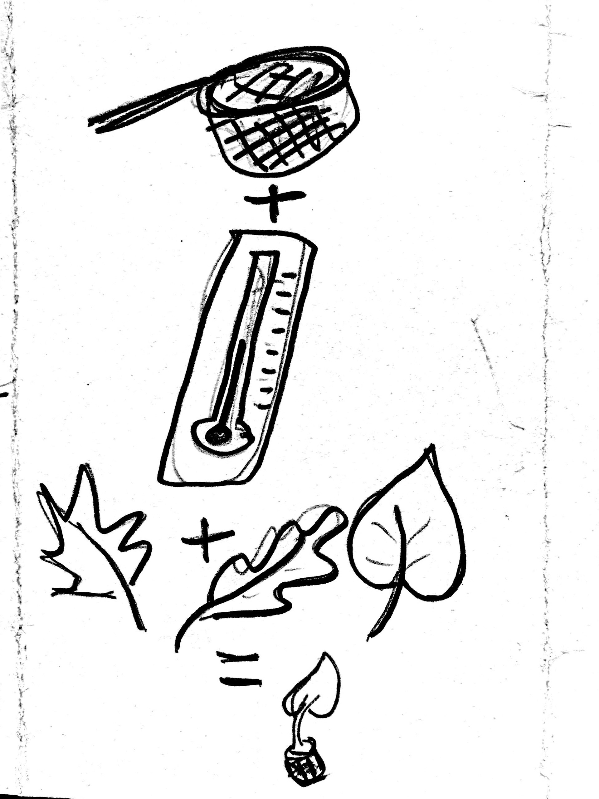
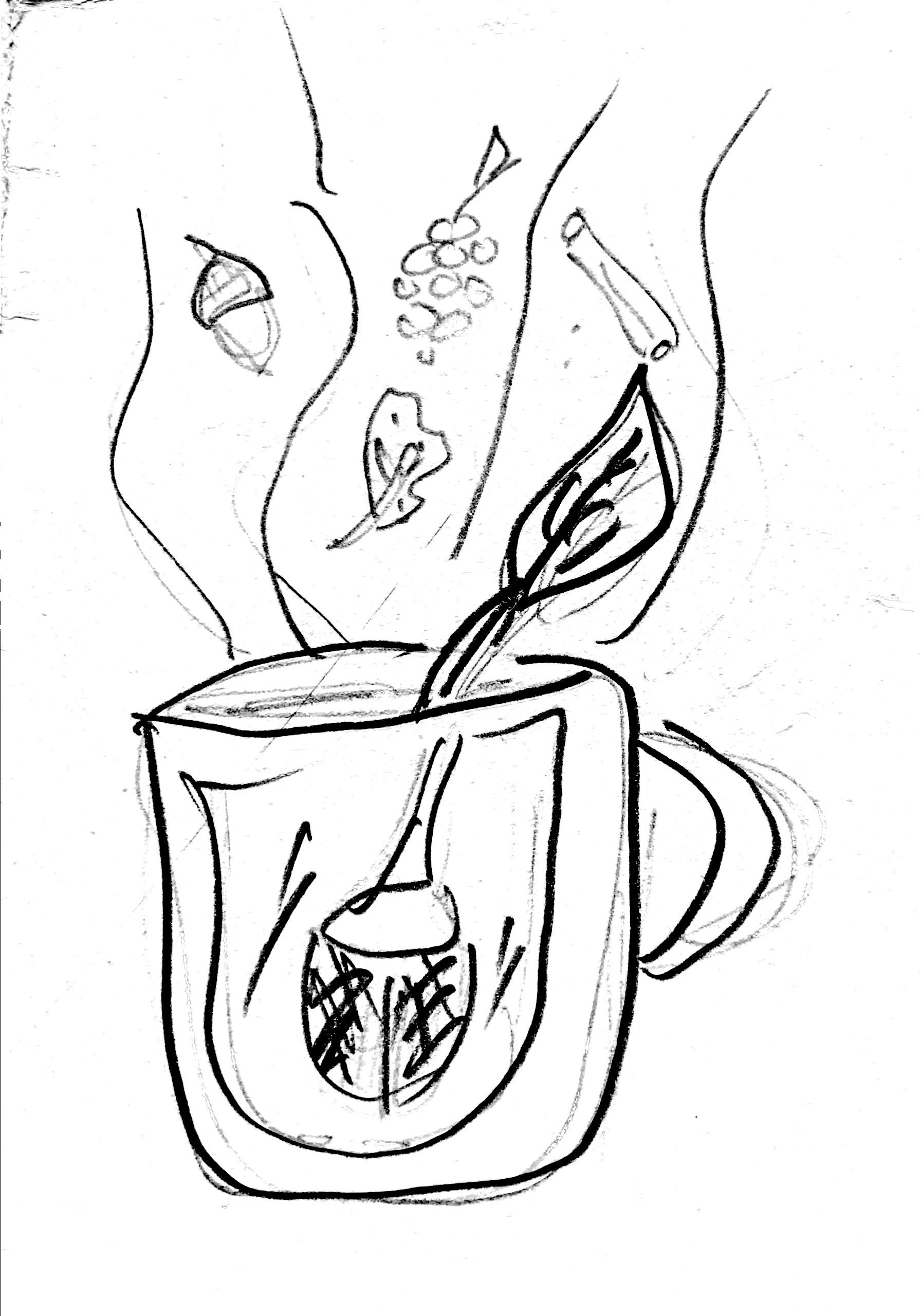
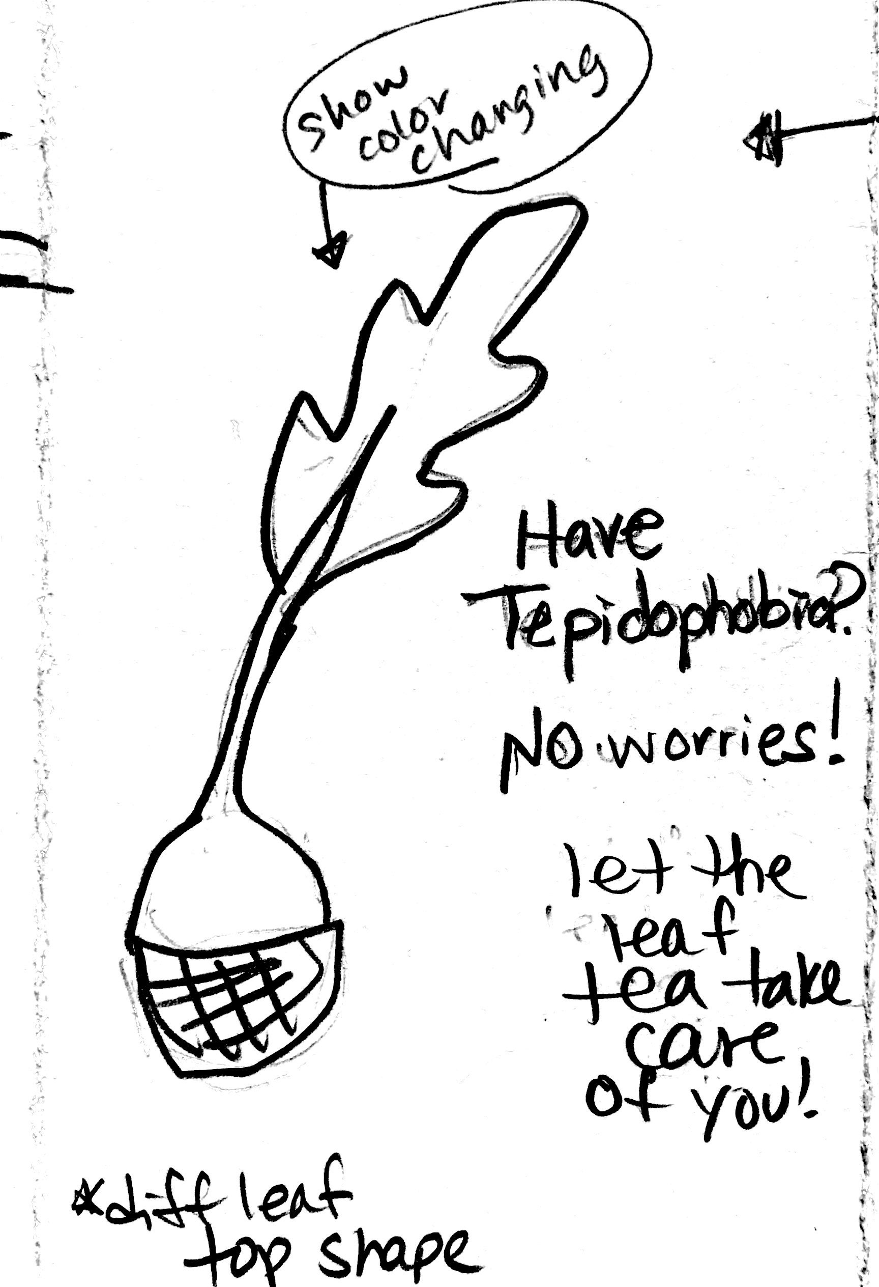
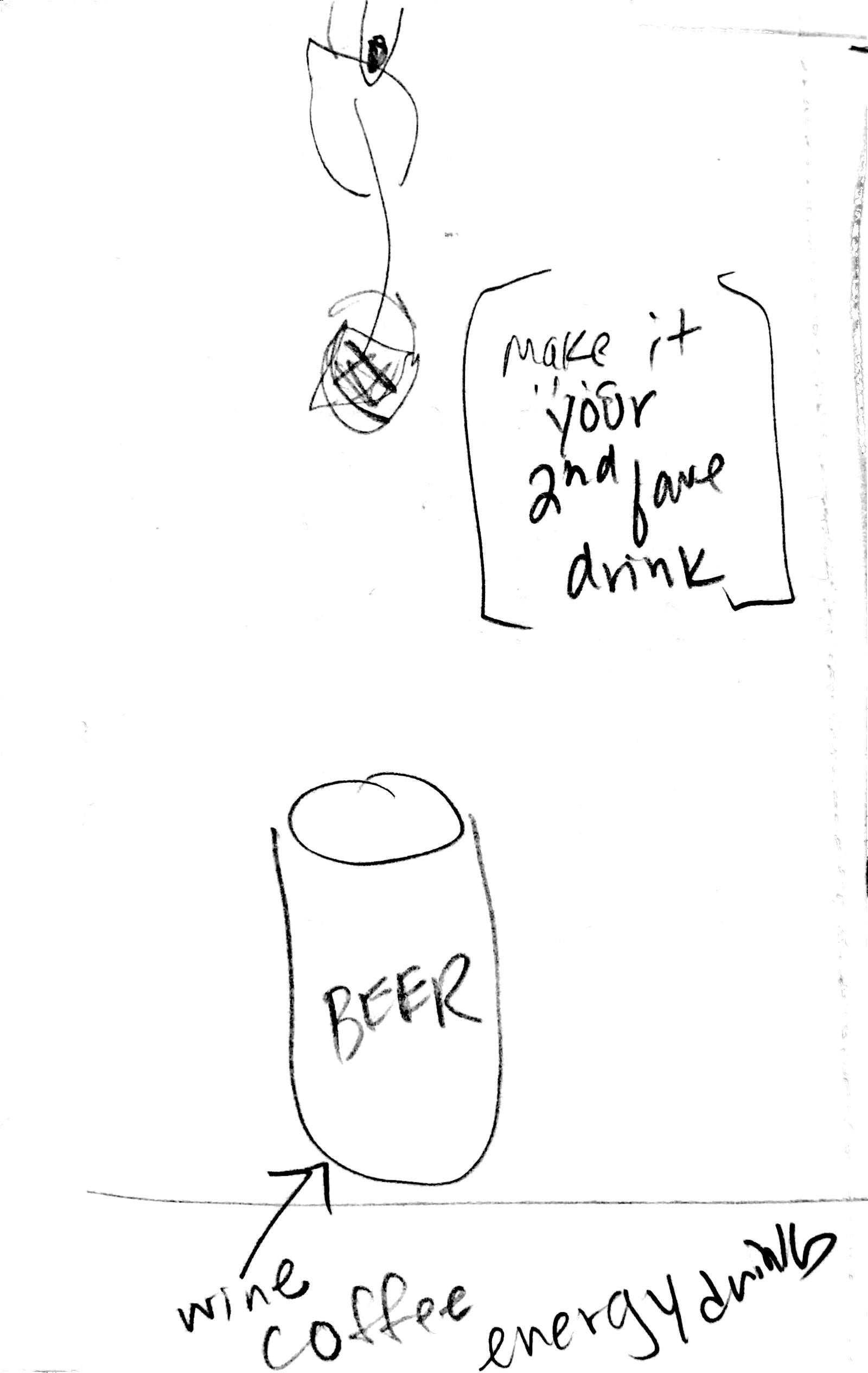
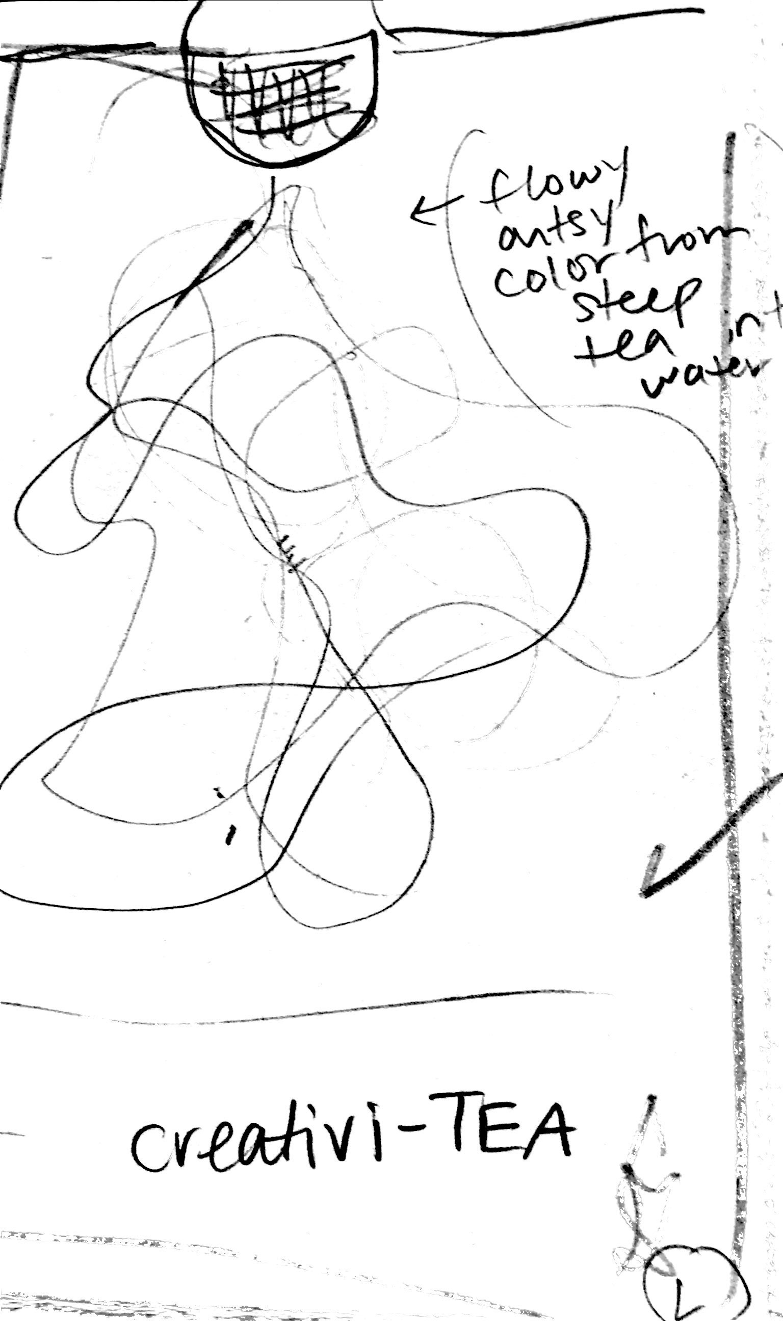
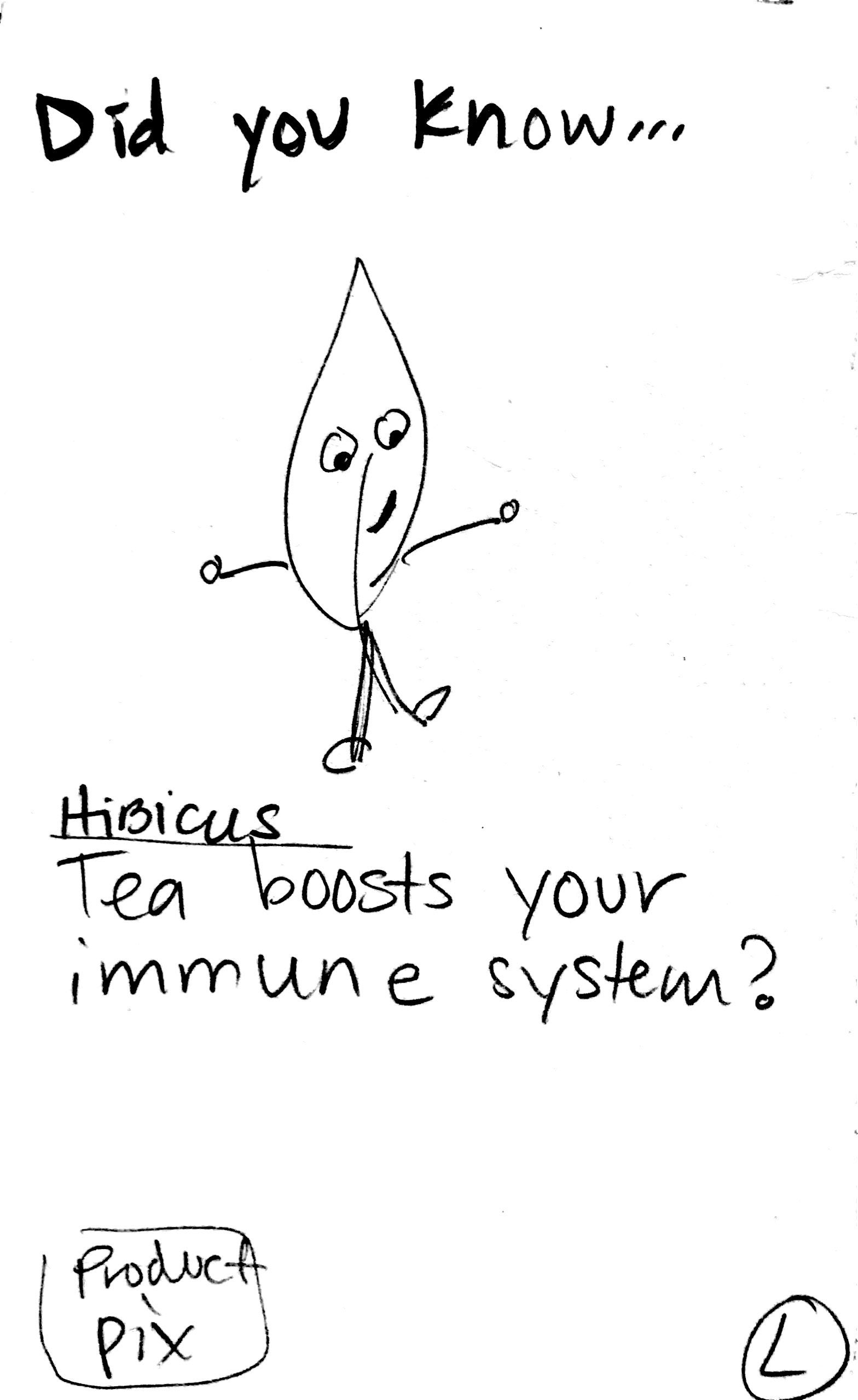
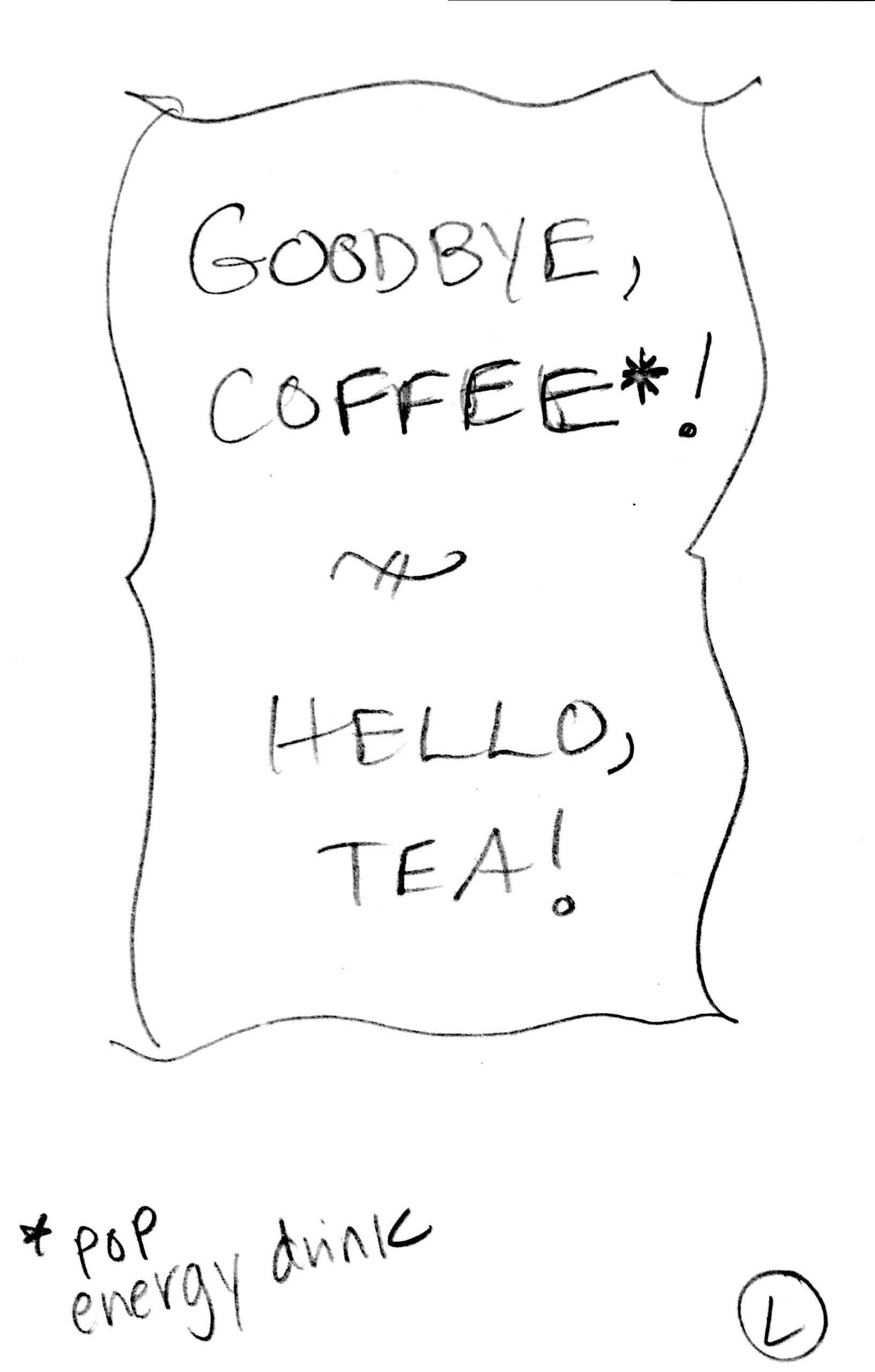
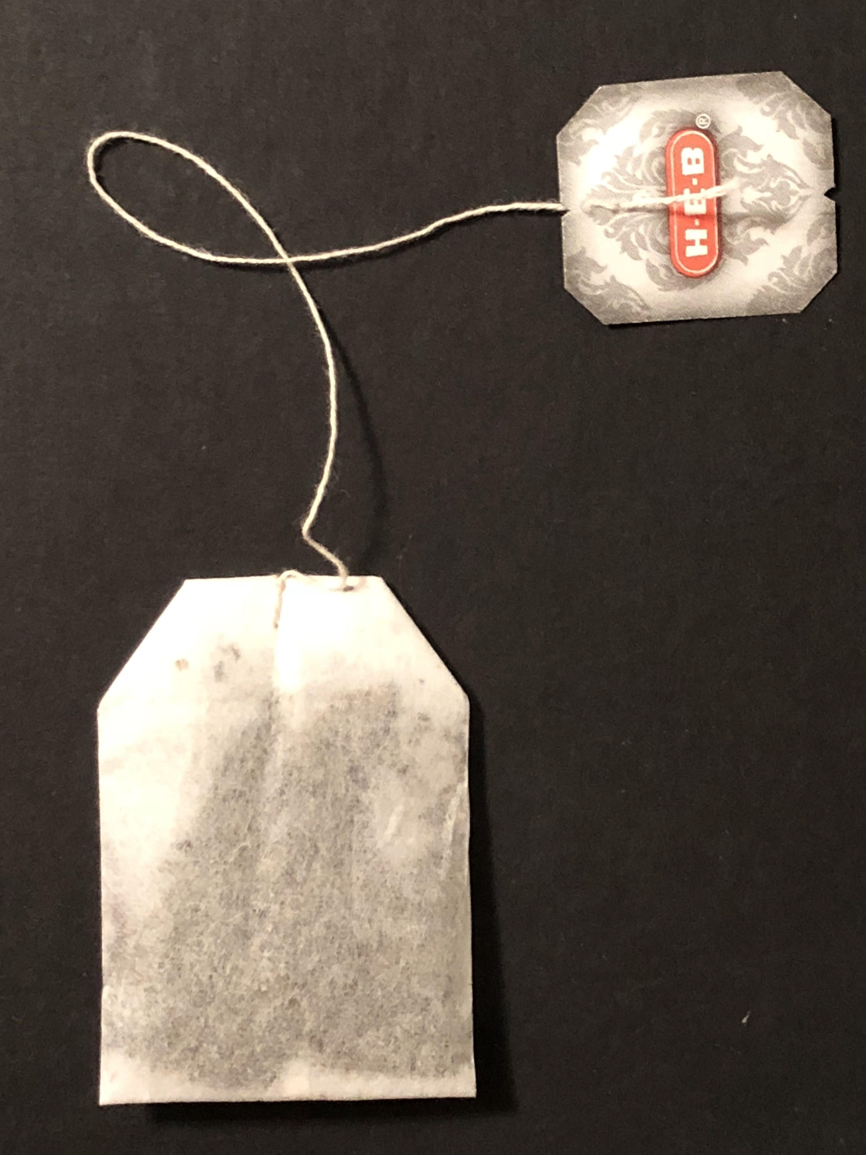
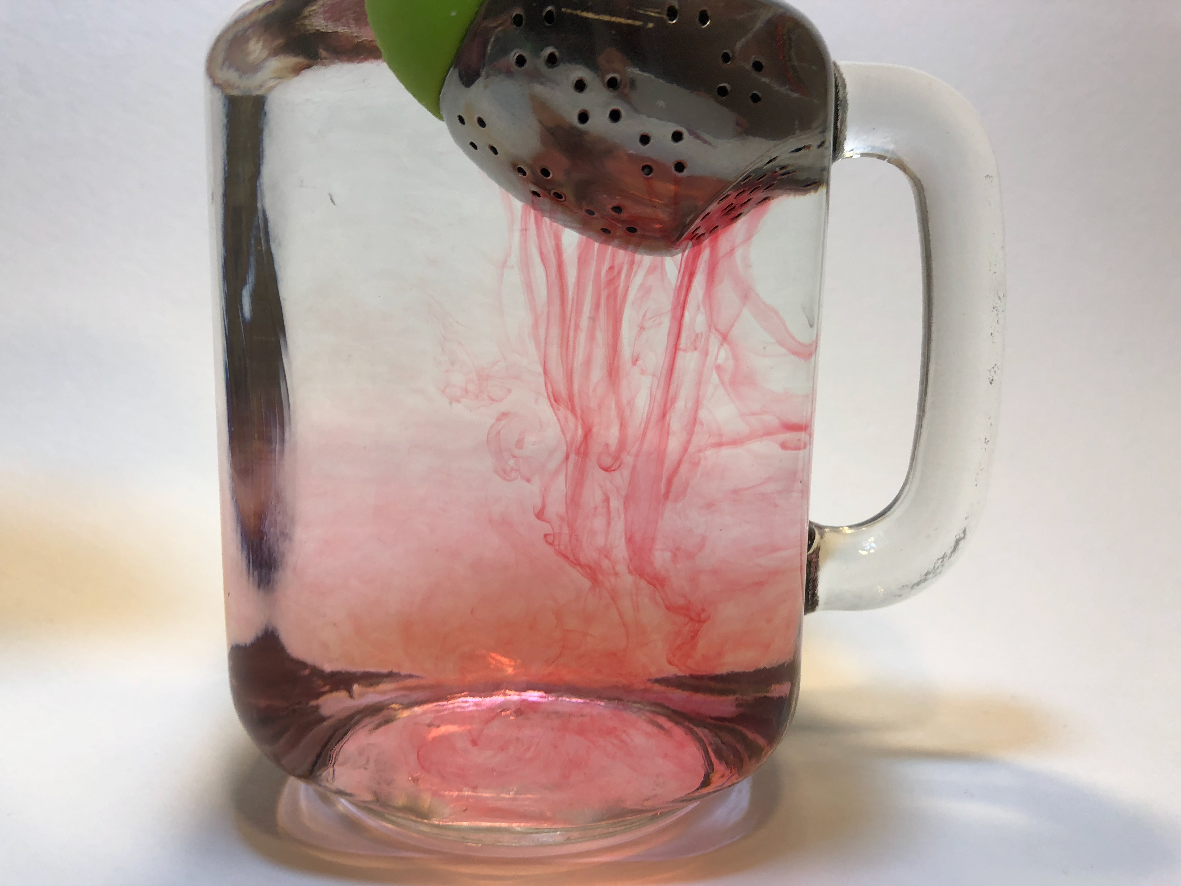
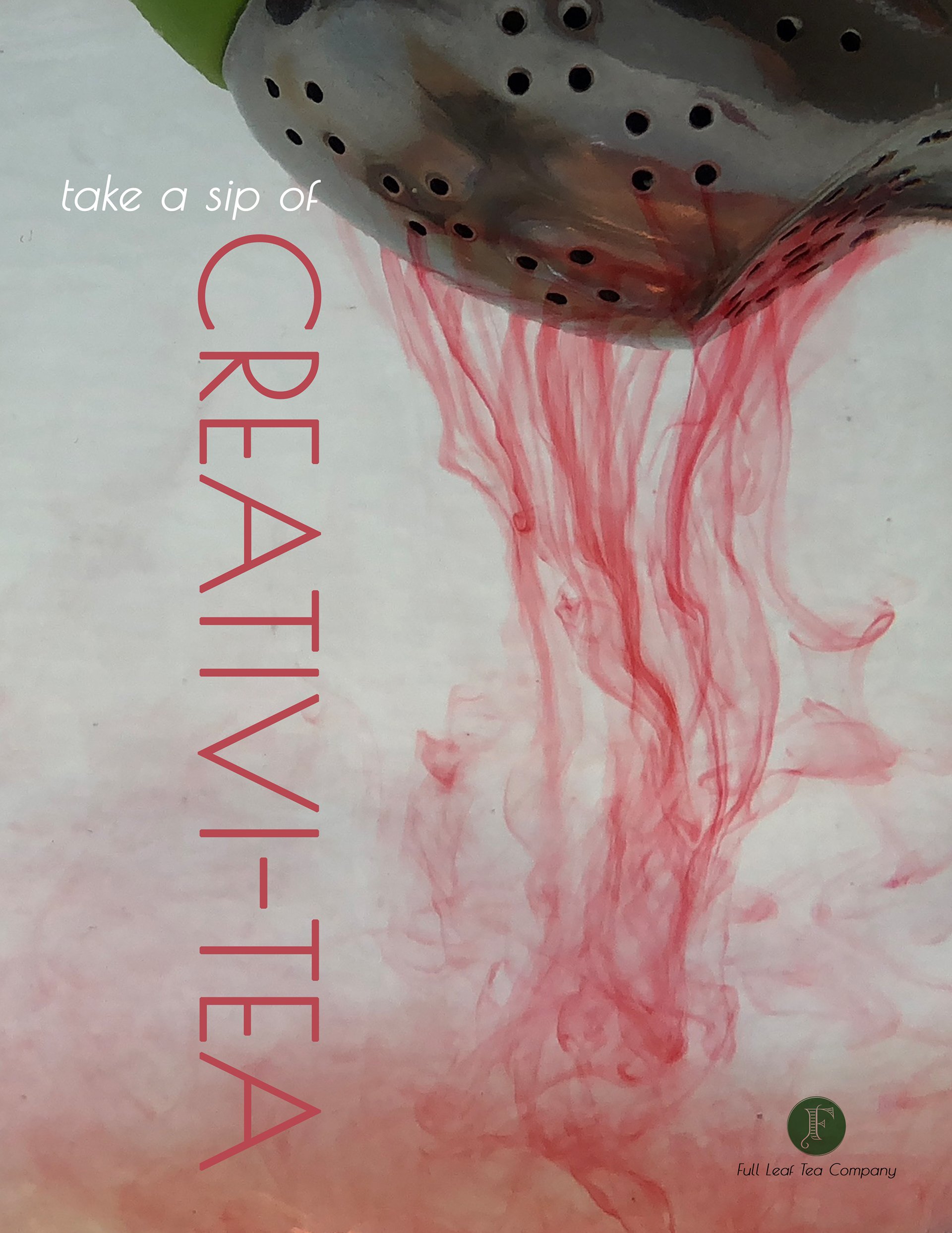
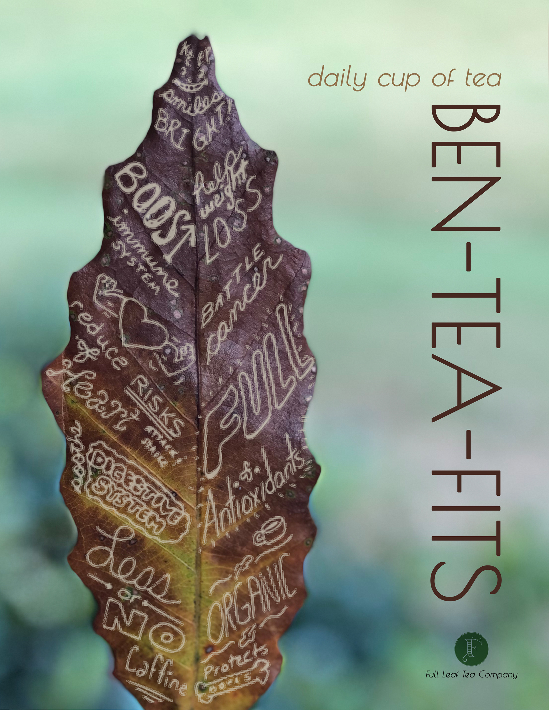
Pictures & an Illustration for the ads
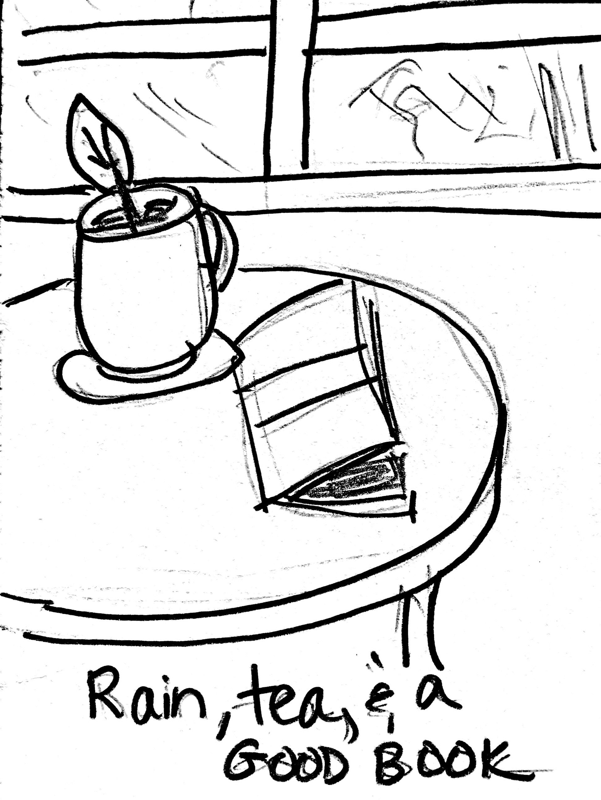
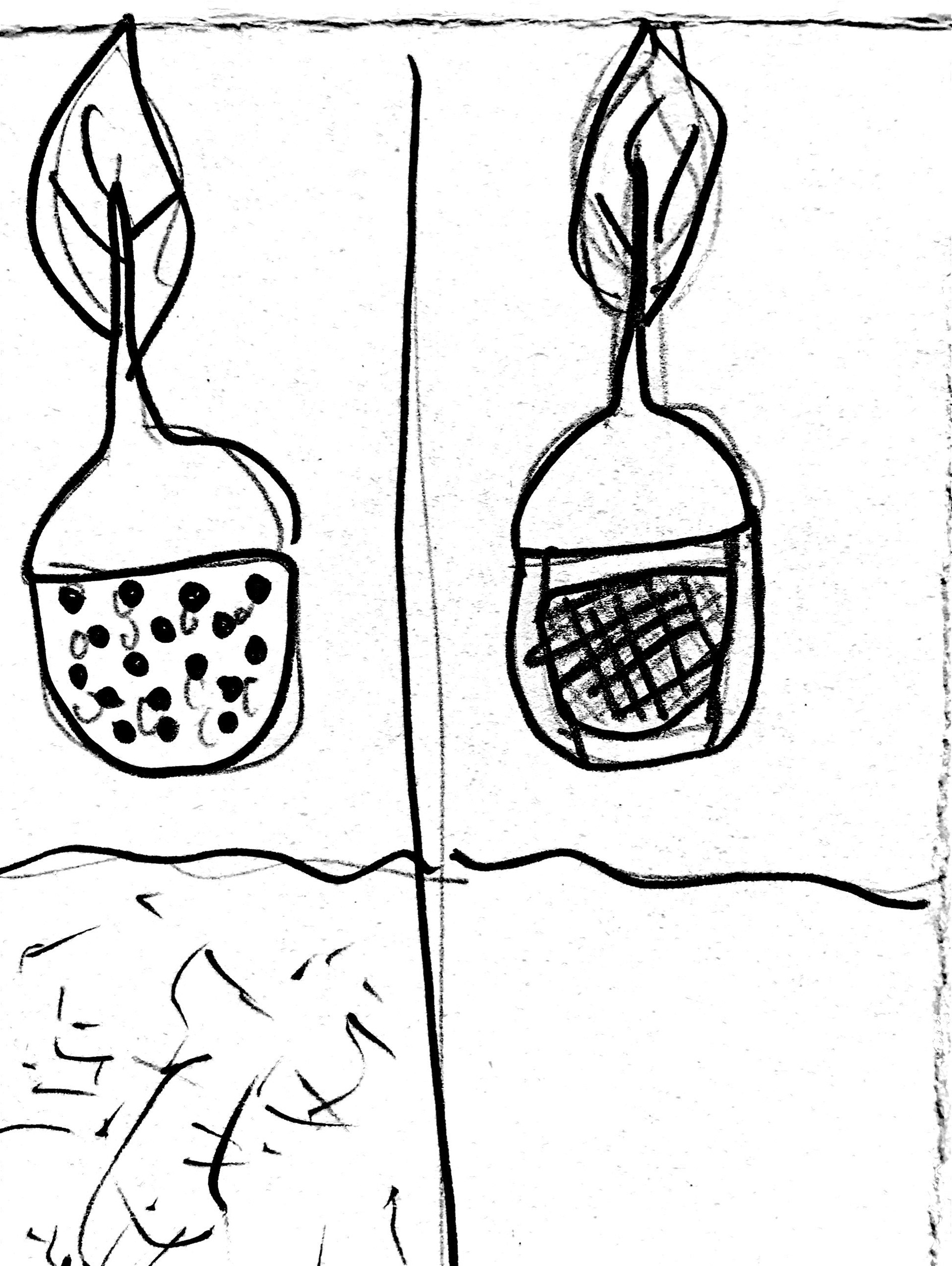
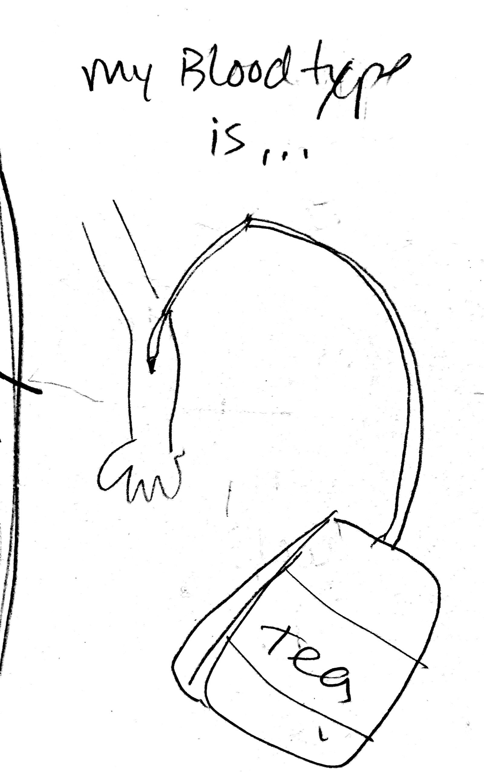
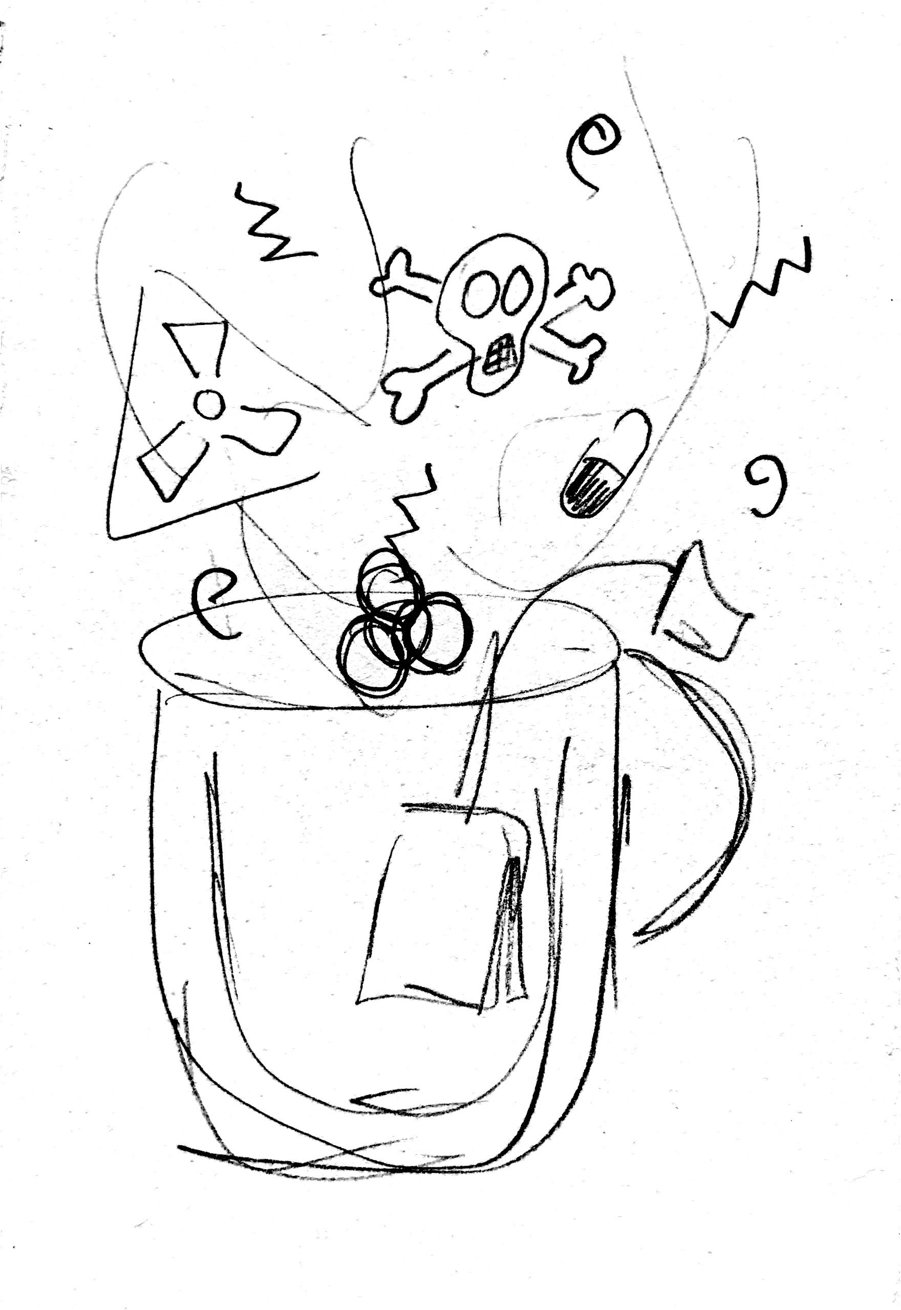
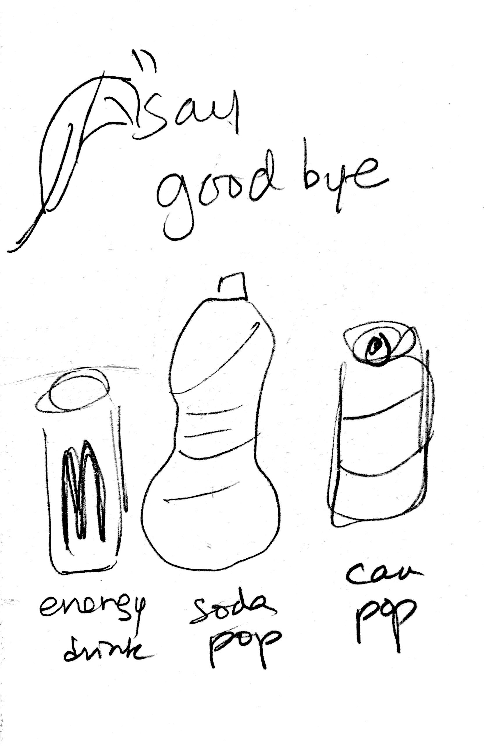
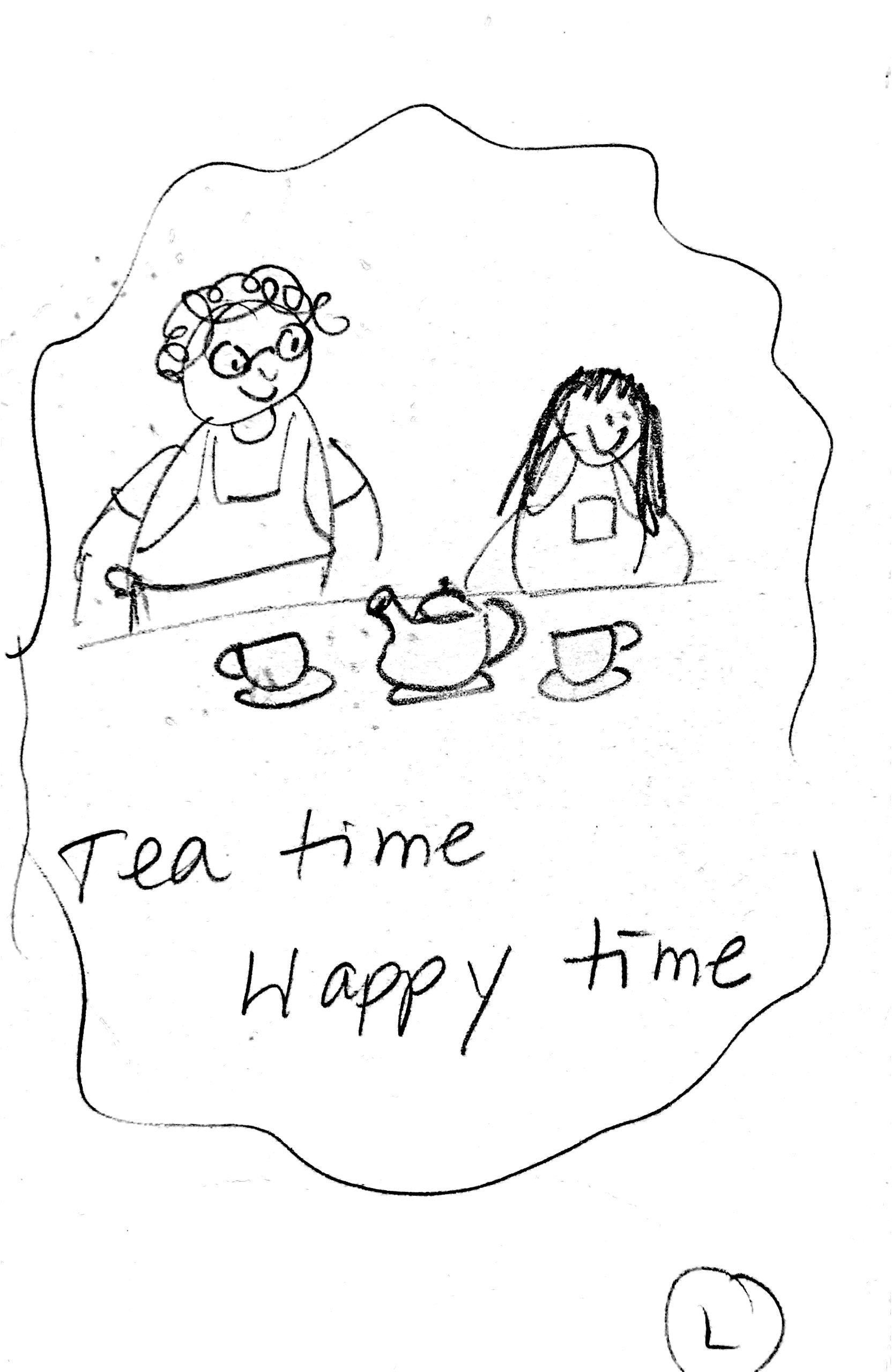
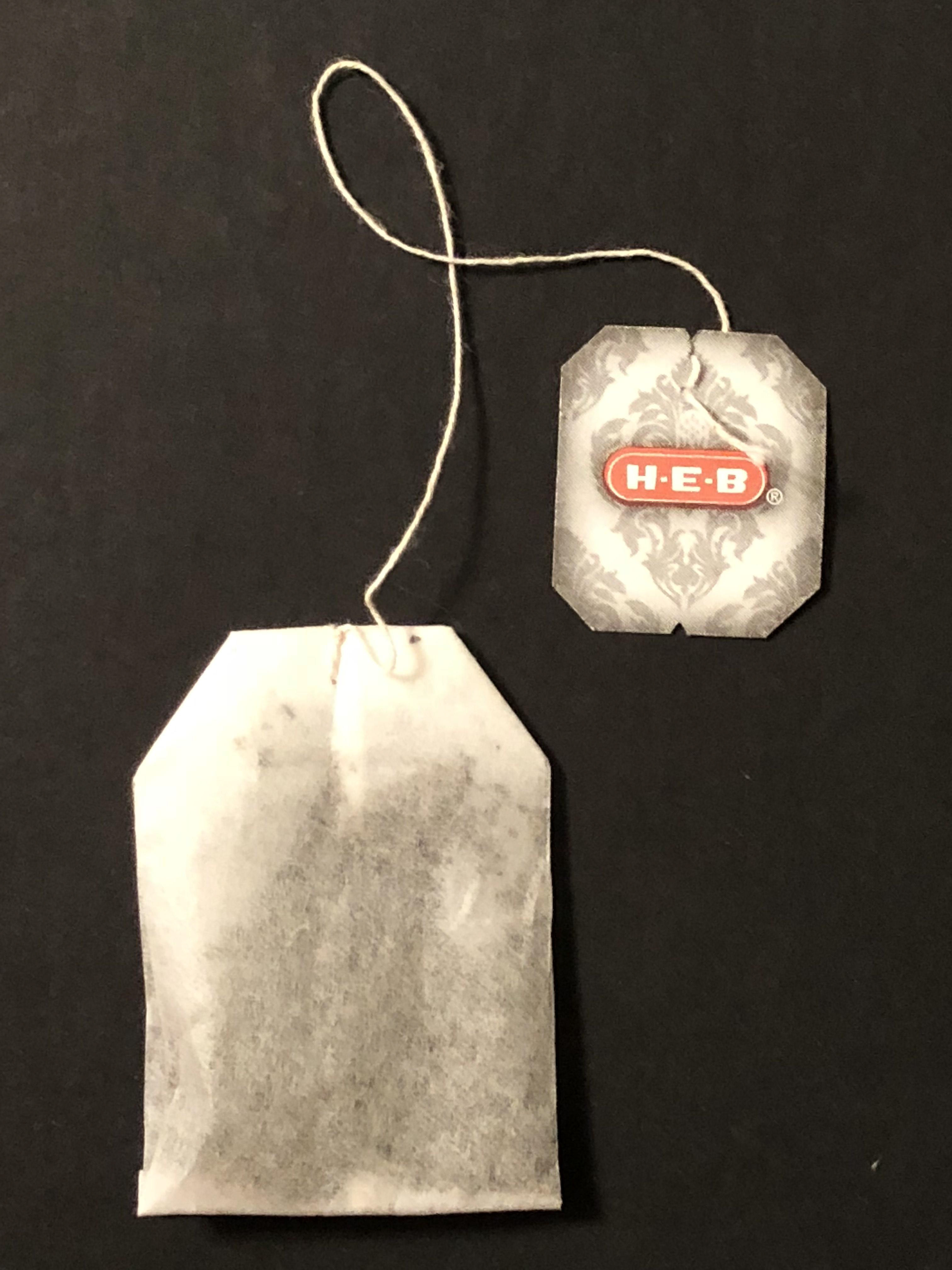
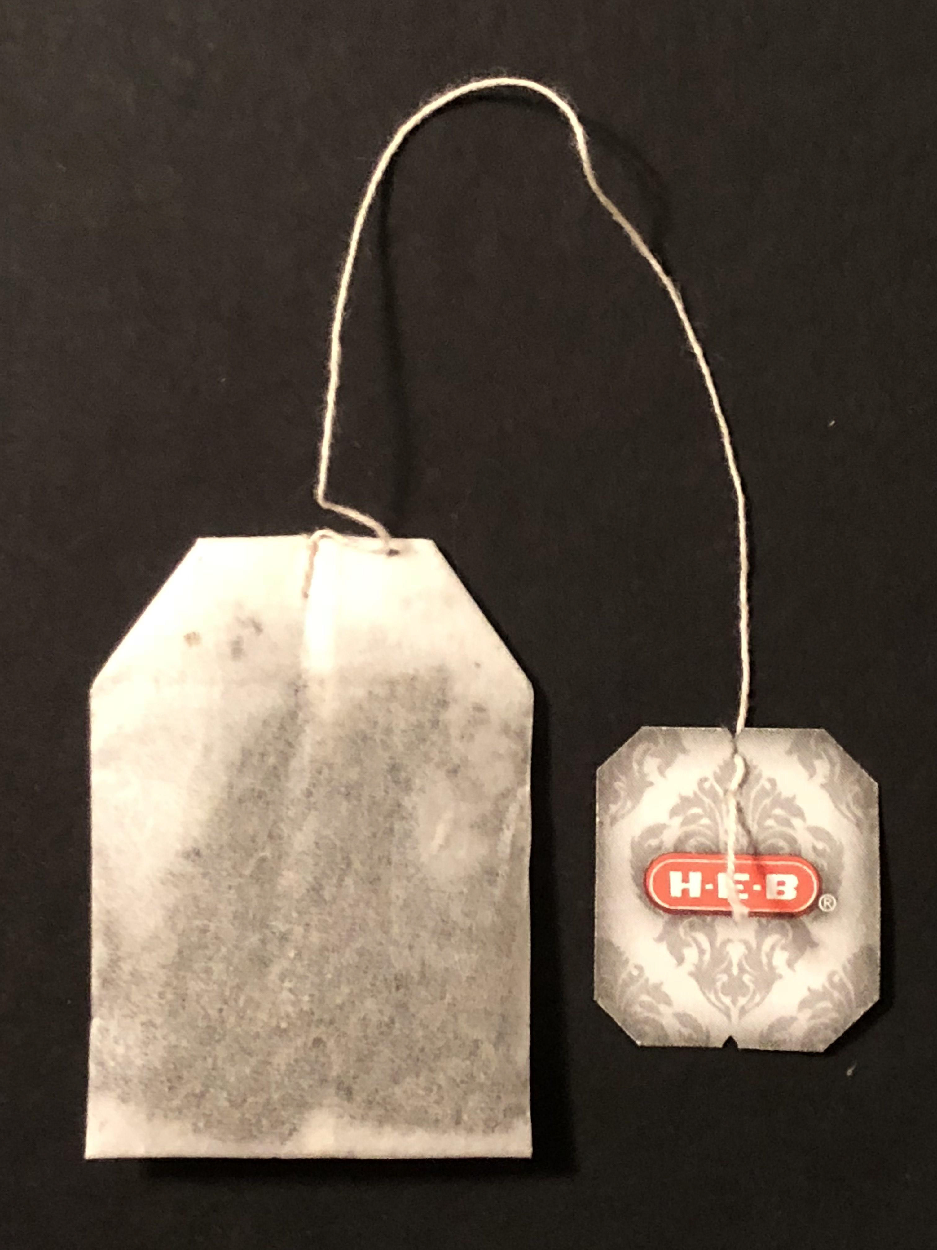
The fun part was to make personal photos and an illustration in order to make the ads more realistically and eye-catching. Once captured, photos were placed into Adobe Photoshop and the ads designed from there. There was one ad that required handwriting style text; which was hand-written as well and placed in Photoshop and applied on an image. Here are images that were created personally.
The fun part was to make personal photos and an illustration in order to make the ads more realistically and eye-catching. Once captured, photos were placed into Adobe Photoshop and the ads designed from there. There was one ad that required handwriting style text; which was hand-written as well and placed in Photoshop and applied on an image. Here are images that were created personally.


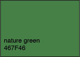
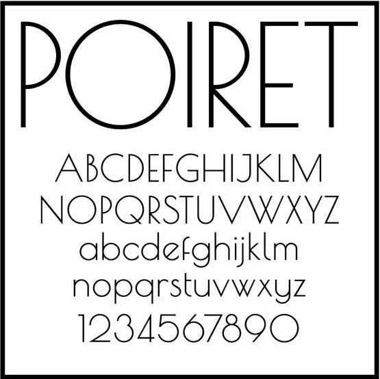
Color Palette and Font
Since Full Leaf has a strong belief in making their product pure, high quality, and organic, the color palette will be neutral and natural like nature, especially in green and brown tones. Some colorful splashes are added depending on the flavors of the tea. The logo color is mainly green, preserving the color chosen by the company. It is also versatile and coordinates with the product and tea flavors; although the logo is usually in one-tone light color to pop out and allow consumers to recognize Full Leaf’s identity. A simple yet elegant san serif font called “Poiret One Regular” is used in the ads. Again, it is desired to have the designs focus on the image rather than the text in this project.
Since Full Leaf has a strong belief in making their product pure, high quality, and organic, the color palette will be neutral and natural like nature, especially in green and brown tones. Some colorful splashes are added depending on the flavors of the tea. The logo color is mainly green, preserving the color chosen by the company. It is also versatile and coordinates with the product and tea flavors; although the logo is usually in one-tone light color to pop out and allow consumers to recognize Full Leaf’s identity. A simple yet elegant san serif font called “Poiret One Regular” is used in the ads. Again, it is desired to have the designs focus on the image rather than the text in this project.
Final Outcome
Here are the final digital images of the series ads created.
Here are the final digital images of the series ads created.


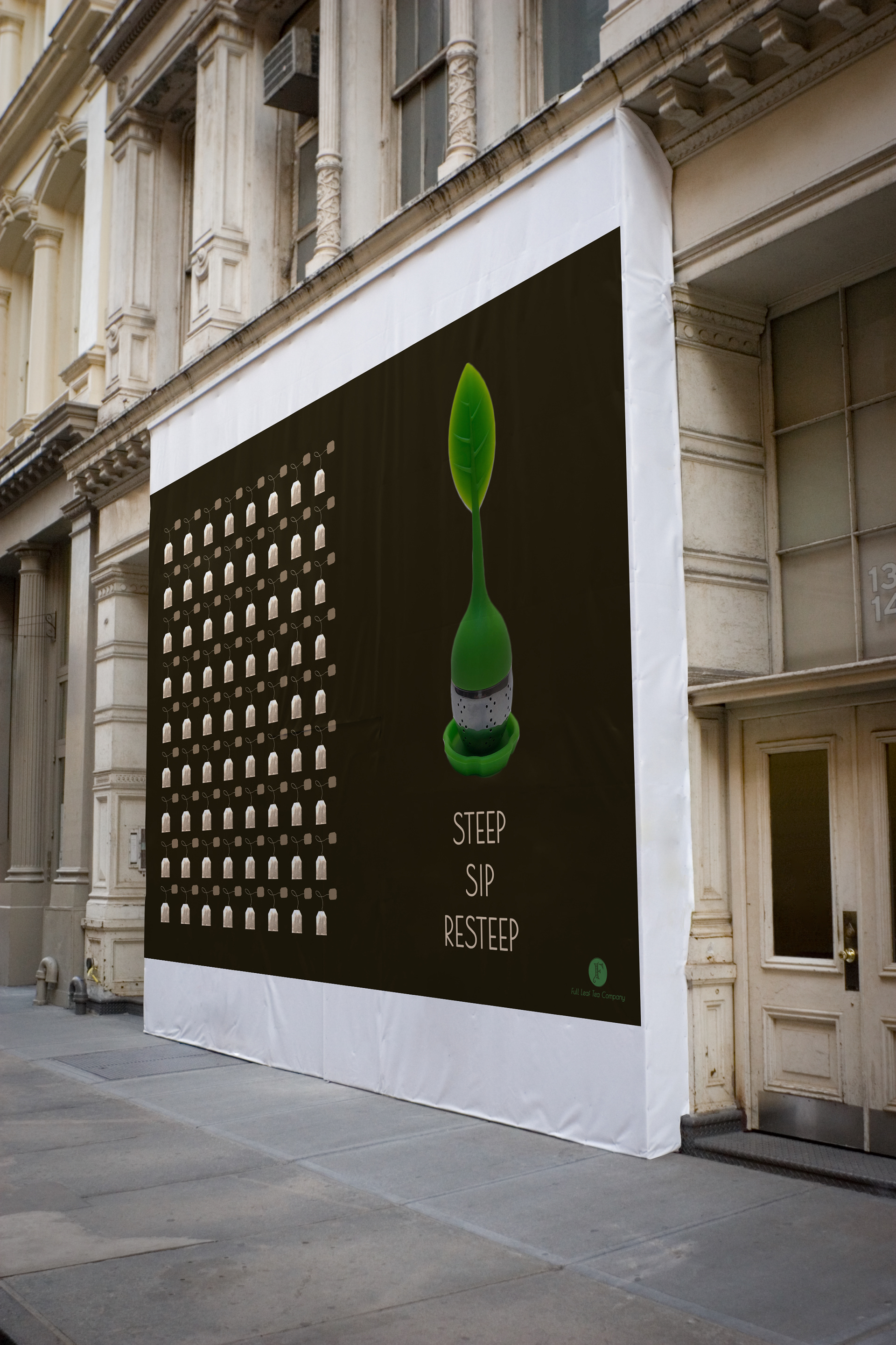
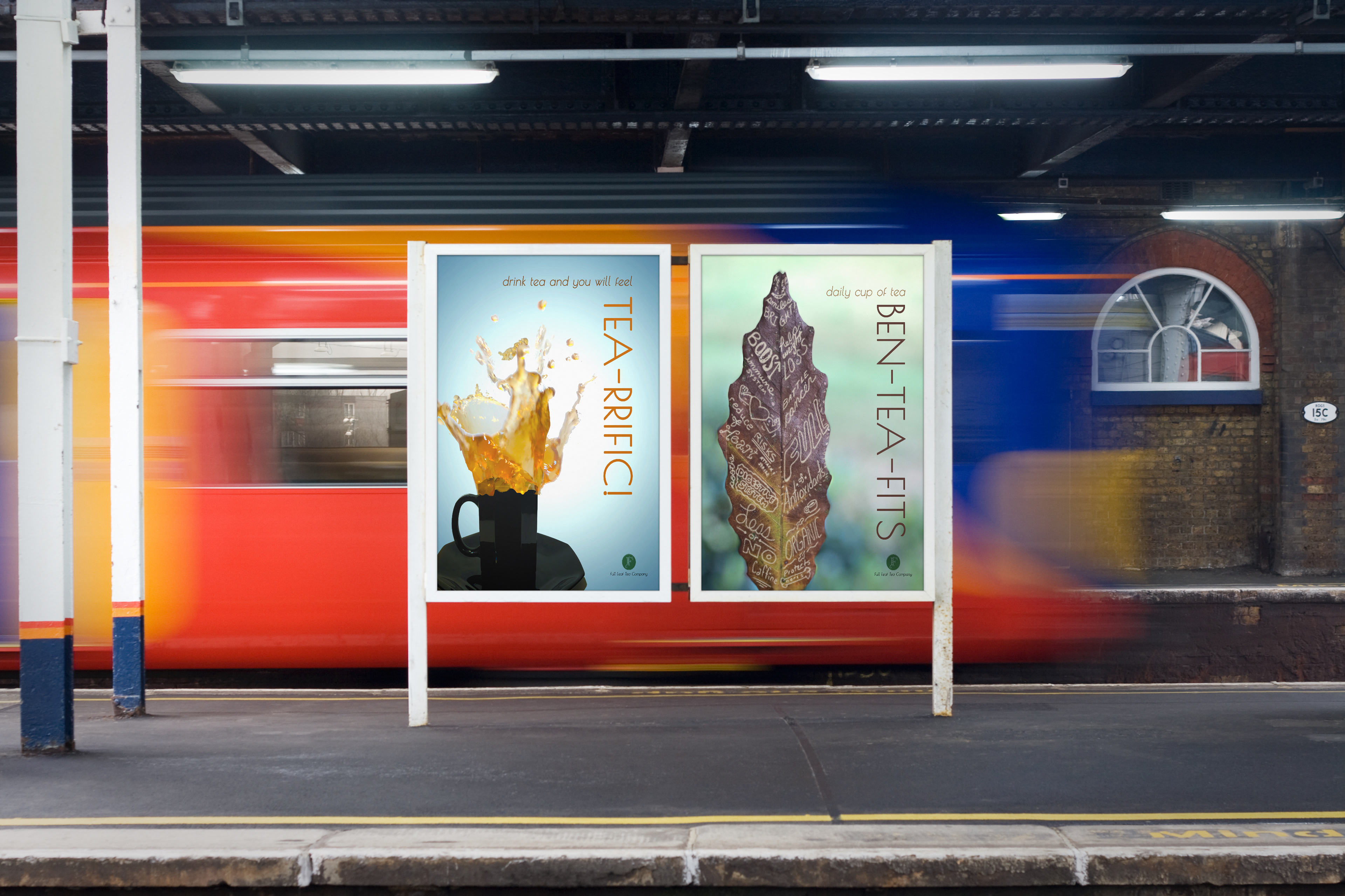
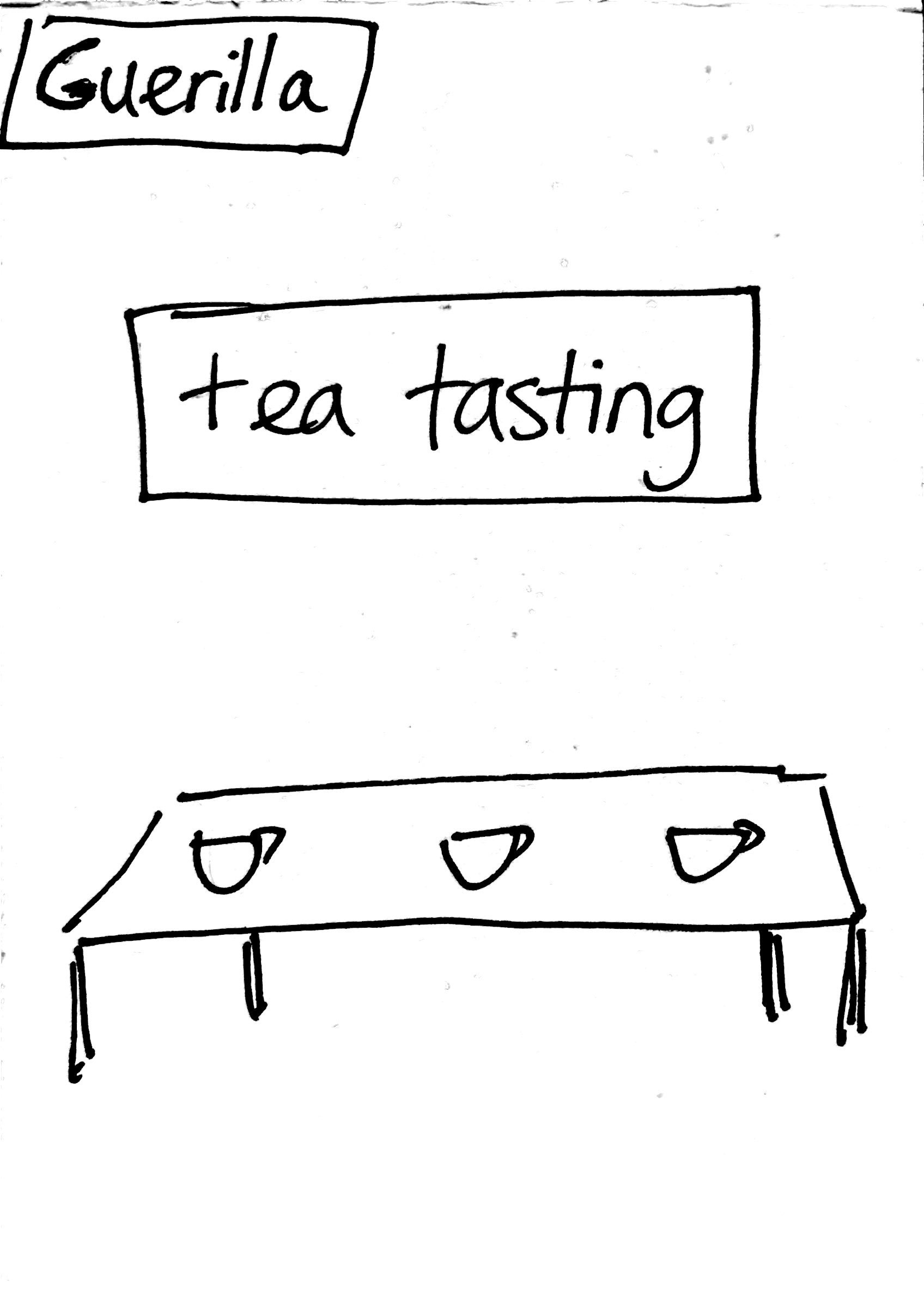
Application
Here are some images of how the advertisement prints in magazines, posters and in public displays will appear with our new logo and ads.
Here are some images of how the advertisement prints in magazines, posters and in public displays will appear with our new logo and ads.